Jay Gee's Nook

A quick Get Well card for a relative under the weather:


This was my first attempt at using paint on a card... You can see that it's still wet here! I def like the effect and will do a better job with it next time.

It's difficult to tell from the photo but the Lemon Tart cardstock is impressed with Mehndi Medallion.

I chose my colors from this month's Jay Gee's Nook challenge: 

Thanks for stopping by!


{Supplies--all Papertrey Ink unless noted}
  • Cardstock: Stamper's Select White, Lemon Tart
  • Stamps: Happy Trails, Healing Touch Sentiments, Bannerific (Lawn Fawn)
  • Ink: Memento Angel Pink, Versamagic Oasis Green and Sea Breeze (all Tsukineko)
  • Dies: Happy Trails
  • Other Tools: Mehndi Medallion impression plate, Corner Chomper (We R Memory Keepers), paint/brush

CP138 & CR84FN Challenges - Thinking of You

Fun, fun, fun. Another challenge entry for Card Patterns Sketch 138 Challenge & CR84FN Color Challenges. Because of computer issues I'm getting this posted just in the nick of time. I loved the sketch immediately. I'd never seen a sketch quite like this which made it fun to take on. And the colours for the CR84FN41...well it was like a breath of spring with winter starting. So here is my take on the challenges.
The two shades of gray leaves came out a little lighter in the photo making it hard to detect the difference between the blue and gray, but it is a little darker in real life.

Thank you for stopping by. Happy crafting!


TOOLS & MATERIALS

PUNCHES: Martha Stewart Deco Fan Corner punch, & Leaf Branch
STAMPS: PTI Botanical Sihouettes, & Hampton Art Circle Birds
Versa Magic Ink
Silver Embossing Powder
Lemon Yellow Liquid Pearls
Ammerican Crafts Premium Ribbon - Butter
Gray Pearls


HAPPY BIRTHDAY DANA

October 22nd is Dana's birthday! I miss being close to Dana and the grandchildren, and miss having our crafting sessions together. I'm so glad that Dana reintroduced me to scrapbooking and paper crafting. I hadn't scrapbooked or paper crafted  for many years until a couple of years ago now.  So, Happy Birthday Dana, and thank you.

I chose to work with a colour combo I had never used before to stretch my creative mind and this is what I came up with.
Close up of the flowers using Cuttlebug scallop circle dies.
Close up of the medallion using Spellbinders Labels Six.
Well Dana, hope that you have a great day filled with good things, and people that are special to you.

Sunday Best at Eight

I was browsing through some of my favorite blogs that I haven't visited for a while. (If I visited all of my favorites every day I wouldn't have time for anything else.) I noticed that many of my favorite projects by these very talented women were done in very soft colours. So I just had to try it for myself. Am I ever pleased at the outcome.
 
I chose to work with a photo that I had hand cut into an oval some time in 1996 or 1997 and didn't get any further with it. I Had to use my largest Spellbinders oval to cut it down just a little at the top and bottom, and was the tiniest bit narrower than the die. I worked though! And here it is.
 
There is silver glitter all over this paper so I decided I had to add a little myself on the oval framing Dana and use silver Stickles in little dots so that it wouldn't over power the oval frame. Below are some close ups.
 
 The glittery framed sentiment piece I cut out of another paper that went well with the one I chose as the background.The daisy strps are embossed stickers I purchased in Calgary at one of the Dollar stores. To make the dasiy tag I stuck the sticker onto the paper and hand cut around the tag shape. The Butterfly circle was the exact size of one of the Spelbinders Circles. I punched a hole at the top of bothe tags, paper pierced the Daisy tag, and put a ribbon through the hole of the Butterfly tag.

The Post Card, and other pieces that I cut, I edged with Versa Magic Wheat and the tiniest bit of Versa Fine Vintage Sepia in some cases. See below for all the Spellbinders and punches that I used.

Thank you for checking in. I think I might next try making a card with these colours.


TOOLS & SUPPLIES

PUNCHES: Martha Stewart Deco Fan
SPELLBINDERS: Lattice Borderabilities, Ovals, Circles, Lotus Pendants, Labels Six
INKS: Versa Magic Wheat, Versa Fine Vintage Sepia
Black Gel Pen
Border & Tag Stckers
Silver Stickles
Pearls
Prima Pebbles

CPS 240 & CR84FN Challenges

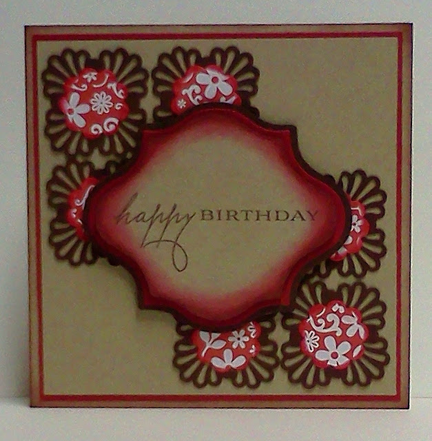
It's time for another card. I chose to enter CPS240 sketch challenge and CR84FN Color challenge. Working with kraft paper has always been a challenge for me, and the sketch I knew would challenge me a little as well stretching my creativity a little. This is my take on the challenges, and I must once again ask that you forgive the poor quality of the photos. It's late, I have to work tomorrow, and I don't have the time or feel like retaking the photos.
 
I used Martha Stewart's Deco Fan corner punch to create the brown base behind the red patterned Provo Craft Cuttlebug Scallop Circle die cuts. The kraft sentiment piece was cut using Spellbinders Labels Fourteen. I used only one of them to create the three pieces tracing the outer edge on the brown and cutting it out; the red actually was die cut; and the kraft piece was traced along the inside of the die, cut out, and ink blended around the edge with a red and then brown ink. Here are some close-ups to view.
Well there you have it, another birthday card to add to my stock pile, and a lot of fun putting this card together. I have a question for you. Do you think I should have inked the edges of the kraft background square like I did the sentiment piece?
 
Thanks for stopping by today. Happy crafting!


Woops! I just realized that I forgot to use brown pearls! I meant to center one in each red circle and add some on the sentiment piece as well. Darn it.

TOOLS & SUPPLIES
Stamps: PTI
Ink: Memento Rich Cocoa, Versa Fine Vintage Sepia, Color Box Cranberry
Punch: Martha Stewart Deco Fan Corner Punch
Spellbinders: Labels Fourteen


"What A Sweetie" Early Years Pics

This page I'm much happier about. I've noticed that I have a tendancy to want to fill up the space and embellish it. I seem to have a problem leaving negative space. I'm trying to work on that and that's probably why my design mojo is off kilter sometimes. But as I said earlier, I'm happier about this one even though the negative space is covered with embelishment.
I think I should have either shown less of the Fleur de Lis border or left it off entirely. I wanted to add more of the cream/ivory color to the layout - more contrast. I may have over done the Spellbinder Daisy Heads too, but I like them.
Here are some close ups.

So there you have it. You can see that I used a corner punch around the patterned circle piece. And once again I used Liquid Pearls. I'm definately a fan of the stuff and find myself reaching for them often. I also like using buttons and Spellbinders and wish I could add more to my meager Spellbinder collection. I'd love to have the Grands too, as that would be a great asset for both cardmaking and scrapbooking. Wouldn't it be great to not have to work, stay home and just craft away? Too bad one can't make a good living with it. Well thanks for stopping by again today. Happy crafting to you all.

Tools & Supplies

Punches: Martha Stewart Leaf Branch & Layered Arches Border & Corner Punches
Spellbinders: Daisy Heads, Flur de Lis Border, Labels Fourteen
Ink: Versa Fine Vintage Sepia & Adirondack Expresso pen
Liquid Pearls: Petal Pink
Rangers Ink Blending Tool & Foam
PTI Buttons

Baby Pics From 1978 & 1979

Yesterday I went out looking/shopping for what I needed to finish the scrapbooking page (as mentioned in this post). Unfortunately I couldn't find what I wanted, so in order to complete the project I had to come up with another idea. I ending up buying an Adironack Espresso Bullet Tip Pen to hand write the title. I should have practised using it before using it on the actual piece intended to finish off the page.
 
 
In deciding on a style for this page, I do on ocassion enjoy CAS and I know that Dana loves it! So that is what I tried to achieve on this page since it displays baby pictures of Dana. My mistake? The roses! I just couldn't find something that would fit there, stamp, or embellishment, and chose to cutout the roses from scraps. And once attached I couldn't take them off without ruining the paper. So it is what it is. (sorry Dana ;) )
 
I love the colors, however, and took care with all of the liquid pearl details. The photo with Dana laughing, is one of my favorites of all her photos.
 
Maybe I need to make a card or two again to get back into some good design mojo....
 
Thanks for stopping by.


TOOLS & SUPPLIES


8 Months Old

In my prevoius posting I mentioned that I was working on a couple of scrapbook pages and had made a card with some of the scraps from one of those pages. This is not that one, but the second one I started. This page contains the photos of Dana when she was 8 months old - June 13, 1979.
The top photo was taken at my parents (Omi & Opa to Dana and her siblings) home on that day to celebrate my Dad's and twin sisters' birthday. Yep, three birthdays, on one day,in one family. The bottom to photos were around that same time of the year taken at Grandma's home (Dana's Dad's Mom) with my sister. Isn't Dana a cute and beautiful baby? Well, I guess all Mom's feel that way about their children, but I know that a nurse at the hospital Dana was born at said that she had never seen such a beautiful baby as she was born. Dana is now a beautiful woman too. Hope I'm not embarrassing her too much.
Back on topic - I was always hesitant to scrapbook these particular photos as they are those old poloroid ones. Since over the years the children had written all kinds of things on the bottom, wider white frame part, I had to trim them. After taking care of that there was still some evidence of writing and scribling, so what could I do to cover that? I happen to have in my jars some green leaves punched from scraps that are very close to the green color of the papers I chose, and with the leafy and flowery patterned paper, why not use leaves.
However, I should have done what I always do and layed them all out first before starting to glue them down. I'm not to happy with the result, but it does do the job.
The flower pots are cut out of "Dig It!" Pinecone Press Papers which is on the backside of the green paper used as the background.
Tools & Supplies
Stamps: Technique Tuesday-It's a Date
Ink: Memento Black Tuxedo
Black Gel Pen
Black Sharpies Pen
Punch: Martha Stewart Leaf Branch
Spellbinders Labels Fourteen

Playing in Paradise Sketch

This week's Playing in Paradise sketch challenge is done with 20 minutes to spare!

I just couldn't pass up this sketch! It's fabulous, Allison!


I didn't have any particular ideas in mind except to use my Half & Half dies and a Christmas theme. Since I was in a rush, and these papers were still out from this project, I went with a rustic Christmas theme.


Nothing says rustic like the dirty front porch in the background!! ;)

I was in too big of a rush and my embellishment vs. sentiment distribution didn't really work out. Oh well!  Love the colors, though!


{Supplies--all Papertrey Ink unless noted}
  • Cardstock: Kraft
  • Patterned Paper: (Pink Paislee)
  • Stamps: Holly Jolly
  • Ink: Walnut Stain Tim Holtz Distress Ink (Ranger)
  • Dies: Tattered Banners (Tim Holtz Sizzix), Half & Half, Holly Jolly
  • Other Tools: rustic jute twine, Burgundy Stickles (Ranger)

Missing You

I guess both Dana and I had a very busy few days as we each didn't post anything for a while. We're back though by the looks of things.
I started a couple of scrapbook pages and have them almost finished, but I need to go buy something in order to complete one, and the other is just about done. When I saw some of the scraps left from the first one, an idea for a card came to mind. (Actually there are enough scraps to make several cards)
I had a couple of issues when puting the card together, however. The  stenciling of  the sentiment Label didn't work out well as the die moved creating a wider boarder at the bottom.  And, second, the application of the liquid pearls ended up being a little more inconsistant than usual with differing sizes, spacing, and even angle of appliction. Since it's more noticable than usual it's bothering me a bit. Darn it all. I decided to go ahead with taking the photos and posting it any way. Detail photos are next.


To the upper left you can see a peek of the inside; above right is a close up of the sentiment label; and left, a side view to see the pop-up of the sentiment label. 

Now as to the reason behind making this card a "Missing You" card....well I went to use a snetimtent from Flourishes Tag Lines when I noticed that I had used each one except for "Missing You". That made me think that I should use it, because I sure miss being close to Dana and the grandchildren since I've moved, and there would be a card ready for me to send to her somewhere along the way. Now Dana will be wondering when this card will appear in her mail box. But with her birthday coming up on the 22nd, it will be a while before she gets it.;)
One more thing before I sign off, I love the colours of the card and I hope Dana does too. Thanks for stopping by today.
Tools & Supplies

Spellbinders: Labels Fourteen & Fleur de Lis Borderbilities
Ink: Versa Fine Sepia, Memento Rich Cocoa
Brad from the Dolar Giant in Calgary
Liquid Pearls: Mint Green & Ranger Adirondack Dimensional Pearls - Mushroom
Stamps: Flourishes Tag Lines


Young Crafter's Unite - Thankful for You

Did you know that Oct 5 was World Teacher's Day?

Well, I found out only after the fact.

The timing was very close to (Canadian) Thanksgiving but I forgot to give my son's teacher a shout-out for that, too!

I'm making it up to her (hopefully!) with this card, along with a pumpkin loaf.


Worked with patterned papers for this card! I also used my Tim Holtz Mini Rosettes die.

Before I put the twine on, I was examining my card before taping everything all up. The card reminded me of Karen Baker's style, which gave me the idea to add the twine.

How about that? Embellishing via association! ;)

I'm trying to remember to coordinate my envelopes with my cards. I usually add a liner to my envies but stamping has such a wonderful effect and Young Crafter's Unite is hosting a challenge on this right now!


I forgot to ink the edges of the envelope but oh well...


{Supplies--all Papertrey Ink unless noted}
  • Cardstock: kraft, Fine Linen
  • Patterned Paper: __________ (coming soon)
  • Stamps: 2009 Autumn Tags, Tag-Its #5
  • Ink: Frayed Burlap, Brushed Corduroy, Walnut Stain
  • Dies: Mini Rosette Tim Holtz (Sizzix), Pinking Circles (Spellbinders)
  • Other Tools: jute twine

Sending Hugs

It's been awhile!!

I've been keeping busy trying to organize my house... If you're interested, feel free to check out my little projects here.

I managed to squeeze a card in today for a friend who's unwell. Even though I usually keep track of blog challenges that I'd like to participate in, I didn't have anything in mind for this other than using some PTI that I haven't yet used (Papertrey Playhouse challenge here). It turned out amazing! ;)


I based my card on the Half & Half stamps/dies. Loved this idea by Nichole (and still do)! I stamped the pattern with Aqua Mist ink and the flourishes and sentiment in Dark Chocolate. I inked around the die cut and the Vintage White card base with Dark Chocolate ink. I scored between the lines of the sentiment and used it as a guide to place a string of pearls. I also placed a pearl in the center of the flourishes.

The sunflowers were die cut, stamped in Memento Cantaloupe ink and edged with Tea Dye Tim Holtz Distress Ink. I didn't like the amount of white around the petals (since I ended up going with a Vintage White card base) and so trimmed them up. The leaves are Ripe Avocado ink and the center is, once again, Dark Chocolate.

The card accompanied some delicious Pumpkin Loaf! I usually make this type of stuff from scratch, but this was a pre-mix from Costco and SOOO delicious!


Looking at this, I wish that I had remembered to coordinate the envelope... It would've been so much prettier!

Thanks for stopping by!

[Edited to add:] Linking this up to the Bling challenge at Lily Pad Cards!


{Supplies--all Papertrey Ink unless noted}
  • Cardstock: Vintage White, Stamper's Select White
  • Stamps: Half & Half, Simple Sunflower
  • Ink: Aqua Mist, Dark Chocolate, Ripe Avocado, Memento Cantaloupe (Tsukineko), Tea Dye Tim Holtz Distress Ink (Ranger)
  • Dies: Half & Half, Simple Sunflower
  • Other Tools: pearls, ink blending foam (Inkssentials)