Easter Card #3 - Sweet Sentiments


 Surprised you by putting my card first, didn't I?

Today I'm sharing with you my Easter card #3! Taking the same Graphic 45 papers (Sweet Sentiments) as with the other two, I created something a little different. I had a few little bits of bling I cut off from a flourish that was left over form the layout (58th Wedding Anniversary) and didn't really want to package up those little pieces again, nor did I want to throw them out! I knew I would be making another Easter card, and Craft Hoarders Anonymous Challenge #4  with the bling, glitz, and glam, was still on my mind. So, why not make my 3rd Easter card using the bling left overs, and create a card for the challenge as well!


 I did something a little different this time, something I haven't done for a while. Using my Snow Cap Acrylic Paint Dabber around the edges of the paper, and to paint the metal filigree embellishments I have from Monique's "ButterBee Scrap" (love her store!), I gave the card a modified Sabrina version of the Shabby Chic look.


When I create a square card, my favorite size is 5 1/2" x 5 1/2". I find that the 6" sq is too large. On occasion I like 5" sq, and the smallest I like to work with is 4 1/2". I have on occasion made some smaller square cards for special projects, but my favorite size the 5 1/2" x 5 1/2".

As per my posting habit, here are photos of the card from differing angels.


You'll note that I also added bling to the metal filigree pieces in the corners o the card.


Do you want to know a secret? The blue paper under the pink, has a very large piece missing out of it because I fussy cut something out from the other side. It was a good thing that I hadn't cut to where I wanted to fussy cut, by cutting from the outside edge in to it. I decided to poke my scissors in and cut from there. Doing this later allowed me to use this corner of the paper as you see now! That's why I didn't pop this layer up, in case you are wondering that is.

Thank you for stopping by, and happy papercrafting!


Added April 2, 2014

With so many wonderful projects entered for this challenge, I was pleasantly surprised to find that I had won challenge #4 with both this card entry and my LO entry "58th Anniversary". Wow! Thank you Gloria and CHA DT!

58th Anniversary - My Mom & Dad

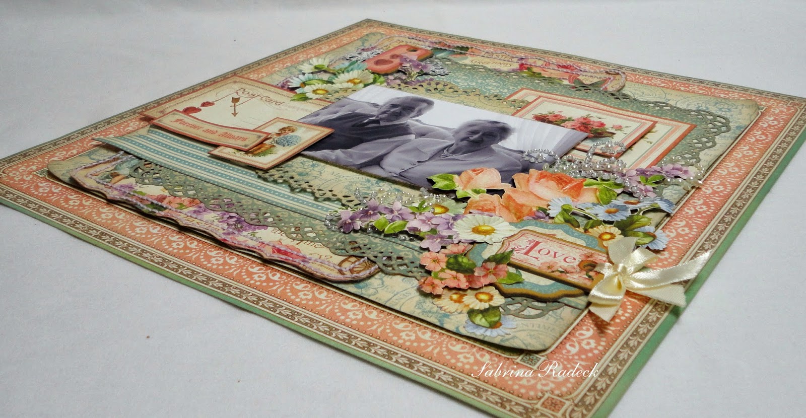
My Mom and Dad just recently celebrated their 58th wedding anniversary! My Mom knows how I often wonder if she will be here for the next one with her not having been well for years now. This last year her health issues have greatly affected her, but she is an amazing woman and an incredible trooper. I'm glad my parents had another year together and hope more for them. I love them both very much. I've wanted to make a scrapbook page of them for quite a while and this seemed like a perfect time and occasion to create a layout about my parents.


I'm also entering this in a challenge! Yeah for me! I haven't done that for a while. I'm entering this layout in Gloria Stengel's Craft Hoarders Anonymous Challenge #4 - Show Some Sparkle, Glitz or Glam!  To the left is the inspiration collage and to the right is the Challenge Blog Badge.

 So here we go!


I've converted the photo I'm using to B&W and using some of Graphic 45's Sweet Sentiments papers, and chipboard pieces. I seldom use bling so with this challenge, this is one of those times. I used an older pearl & bling flourish from Prima and cut it up a little.

Just FYI, there are three items on this layout from the 8 x 8 pad - the small cut-a-part over my Mom with the roses in the boat, the little boy with the blue bunch of flowers under my Dad, as well as the sentiment strip. Everything else is from the 12 x 12 pad or chipboard tags.

You know I always like to show my work from all angles for you; then I'll show you some close-ups.


Detail close-ups -


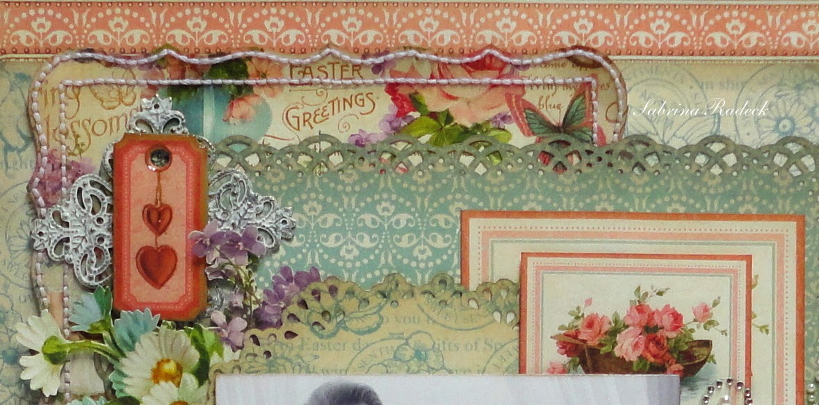
In the photo above, you can see that I painted the filigree metal from ButterBee Scraps and placed it behind the chipboard tag with the hearts on it. The heart chipboard tag is covered with Glossy Accents. I thought this would help add to the "bling" factor.


With the photo above, you see the "glitz" in form of bling and pearl flourishes with the arrangement of fussy cut flowers. And in the photo below, the detail of the stitching around the Martha Stewart "Cherished" border punch.


Let me know if you'd like to make this layout for yourself, because I took photos in the step by step making of this layout because I had something in mind for them, but things have changed.

Thank you so much for stopping by to check out my challenge entry!

Happy papercrafting everyone! 


Added April 2, 2014

With so many wonderful projects entered for this challenge, I was pleasantly surprised to find that I had won challenge #4 with both this LO entry and my card entry "Easter Card #3". Wow! Thank you Gloria and CHA DT!

Easter Card #2 - Sweet Sentiments

My 2nd Easter card is made! At this pace I think I'd better get a move on with these cards!!! If you missed seeing my first Easter card in the previous post, you can scroll down or click here.


I used a lot of Tim Holtz Vintage Photo on this card for a couple of reasons. One, I wanted to darken the brown paper (Spring Has Sprung) from Sweet Sentiments; the one with the text all over it, and two, the person I have in mind for this card will appreciate the effort of the 'Vintage' inking. The tag I punched out of the paper and after inking it with Vintage Photo, I had to use my white gel pen to trace the words and make them stand out and readable.

If you haven't heard of "ButterBee Scraps" for metal embellishments you have to check out Monique's store on Zibbet. She has such wonderful stuff! The metal embellishment that I used for this card was actually a large square filigree that I was easily able to cut into four using my scissors.

Again this is a very dimensional card with all the layers. You can see all the layers in these following photos. And again, I had to fussy cut! I just love using the paper; what can I say? First, is a side view form the left...


...side view from the right...


...from the bottom of the card...


...and a view of the top...


So there, you have seen my 2nd Easter card for this year. I think I forgot to mention that these cards are 5 1/2" square. Did you notice that I didn't ink the fussy cut flowers? I think you can see it more in these photos than you can real life.

Thank you for stopping by today!

Hugs, and Happy papercrafting!


Easter Card 1 - Sweet Sentiments

I visit some pretty special women every month and realized it was time to make them each an Easter card. This is my first of the four I need for this year. I have some family ones still to make too, so you'll see a few more.


And, once again I'm using Graphic 45's Sweet Sentiments. I hope you aren't getting tired of my using the same paper again, but trust me when I tell you I have so much of it in scraps after making the kits for classes. I can't throw it away! So, I have to use it, even though I'm itching to use my new 12 x 12 Botanical Tea paper!


I've often seen this stitching done in some gorgeous layouts, as you see here on the card, when Martha Stewart's "Cherished" punch was used. I so like that look and have it on my list of things to try. I thought I should try small first, so this card was the perfect opportunity!

First, I inked the edges of all the paper pieces with Tim Holtz Pumice Stone, then I did the stitching on that one edge punched piece. Even though it took time, and I stitch quickly too, I'll do it again.

You notice the small 3 1/4" pink frame I created from the frame on the 12 x 12 feature page "Sweet Sentiments". It just took 2 corners and then over-lapping the other two corners with just the corner pieces. I hand cut around the outside and inside of the frame before piecing it and inking it.

Let's look at the card laying flat from different angles.


I forgot to mention that the flowers used on this card are from Kaisercraft, with the exception of the white flower at the bottom left corner, of which I don't remember where it came from. So, I hope you enjoyed this card.

Happy Papercrafting!


Down Memory Lane - A Favorite Oldie

You know how sometimes you come across some of your older projects and wonder what in the world you where thinking when you made it? On occasion, however,  I do come across an older project that I really still love! Recently I saw someone post and old favorite of theirs, and then just the other day, I came across one of my oldies that I still love. This gave me the idea to have "Memory Lane" postings the odd Sunday here and there.

So today I'm sharing an oldie with you. You'll have to forgive the photo however, as this was taken not long after I started scrapbooking and I've learned a lot about taking photos of my projects since then!


It looks like even back then I liked fussy cutting! lol! I stamped and heat embossed with gold all these flourishes, and then cut them all out!  I distressed inked everything, and used those ink pads to color in the scroll quote. Gold liquid pearls to go with the gold embossing and gold gel pen details. I still love that Teresa Collins collection!

You can read more about this project at the original post, but I sure remember how much I loved making this layout! My heart and soul went into this one. I think all my favorites are a result of the whole heart and soul being involved in the project.

Just as a bit of a walk down scrapbooking memory lane.  Do you have old projects that you still love?
Thank you for stopping by and checking out one of my old loves.

Happy papercrafting!

Perpetual Calendar Tag Mini-Album

I have a fun project to share with you today. I've always had a fascination with different ways to make perpetual calendars, and today I'm sharing with you one that also serves as a mini-album.


You can see that I used Graphic 45's "Sweet Sentiments" collection in the making of this projects. After teaching classes using this beautiful Spring colored paper, I had a ton of scraps and lots of leftover fussy cut pieces that I didn't use. I still had to cut more however. I also used pretty much the whole package of Chipboard pieces and a whole package of Tags & Envelopes.

Let me show you the rest.


Are you wondering about the Perpetual Calendar part? I'll show you July's. Every tag front has a slot with a perpetual calendar and a tab, that slides out. It can't come all the way out as it is designed to pull out only so far, and is pushed back in when not needed. I designed the calendars with the number of days for each month, with February having 29 for those leap years.


You may get a better feel for the idea after viewing the video walk-through of this project. Enjoy!


Come back again in a few days, ok. I will have a second part to this project to show you. It will be a wall mounted plaque to hang this album from. Intrigued? I can hardly wait to finish it and show it to you!

Thank you for stopping by to have a look. I love reading your comments, so feel free to say whatever you want!  Happy papercrafting everyone!


THE INSTRUCTIONS WILL ASLO BE AVAILABLE AT PAPER ARCHITECTURE WITH SABRINA AS SOON AS I HAVE YOUTUBE COOPERATING AGAIN. Still working on it.