Christmas Club 2013 - March Class

-Getting ready for Christmas 2013. This class includes two clear cards!


These are the four cards we'll be making for the Christmas Club 2013 March class. All the designer paper used for these cards are form Teresa Collins' Christmas Cottage 6 x 6 pad.


For this card I used MFT Rounded Banner, and Poinsettias Die-Namics. For a narrow gold border around the cream rounded banner I went along the outer edge with a gold Gel pen, and added Gold Stickles to the centers of the Poinsettias.


For this next card...


I used MFT Snowflake Doily Die-Namics and added a few circles and stamped onto one of the patterned papers from the pad, cut it out and popped it up. The white dot were added using White Enamel Accents, and of course Christmas Red Stickles for the holy berries.


Now for the first of the two plastic card stock cards.


The inside...


And the last one...

The Winter Rose die is also from MFT Die-Namics. I used 1/8" Scor-Tape on the front around the designer paper that is behind the plastic and 1/4" Scor-Tape around the outer edge of the card and added the glitter.


And the inside...


Well, that's it for this set of cards. Thank you for stopping by to have a look.

Happy Crafting!


PTI 6th Anniversary: Day 4

As an owner of all the Year of Flowers stamps, I'm thrilled to see dies come out for each of them!

I started this project in anticipation of a visit from a friend not seen in years. I only had time to stamp it all and then color only one calendar page since. Today's contest could not have come at a better time!  ;)


There is Clear Star gel pen on the poinsettia centers which really makes the whole piece memorable.  :)

Thanks for peeking!


{Supplies--all Papertrey Ink unless noted}
  • Cardstock: Stamper's Select White
  • Stamps: Year of Flowers: Poinsettia, Calendar Basics
  • Ink: Memento Tuxedo Black (Tsukineko)
  • Dies: Calendar Page
  • Other Tools: 2013 mini-calendar page(s), Copics, Clear Star gel pen (Sakura)

Shaped Easter Cards

-Getting away from four straight edges

In November I taught a class for "Shaped Christmas Cards" and it was so well received that it was requested we do something like that again. So, for Easter, I thought it would be fun to make cards that once again steered away from mostly straight edges.


It's late, so I'm just going to post all the individual card photos with their detail photos and keep the text to a minimum at this time.


That's it for now. I'll come back at a later time and include a few more details. In the meantime, thank you for stopping by to have a look at the photos. Happy crafting!


March Monochromatic

 - Easter's early this year. Does that mean we'll have an early Spring, I wonder?

With Easter being in March this year, I thought it would be fun to make Easter cards in our March Monochromatic card class. Well, three of the four are. The other is a thank you card. So the colours chosen for this monochromatic class are of course spring colours!


Pretty colours, right? Let's have a closer look at them, shall we. We'll start, first, with the non-Easter card, the yellow "Thank You" card.


I used two different sized doilies under the fan folded medallion/rosette. For the first time, I used Memory Box's Dies-Script "Thanks". The punch is Martha Stewart's Floral Vine Deep Edge Punch.

Here are some detail close ups.


OK. So now come the three Easter Cards. The light green one is one that made me think of my grandchildren as I made it. Not that an adult wouldn't enjoy it...I would.


I just think the bunnies are so sweet. I hesitated using the designer paper as the the little flowers had blue in them, and I added the pink on the bunny feet, ears, nose and cheeks. But I think the overall colour is still a nice spring green.


Next lets look the CAS pink card.


This white and pink is beautiful and would do well for any occasion, such as birthday, wedding, baby girl, etc. I seldom use 'bling', but in this case, I think it works rather well. I used Spellbinders Nestabilities labels three and twenty-three.


 And for last, the spring blue.


 I had an interesting experience in the embellishing of this card. I wanted to use some of the 1/4" organza ribbon that the store recently stocked up on in a variety of beautiful colors, and tried several ideas, not one of them quite right, and my last effort ending up ruining the 3 yards of ribbon I had, without any left to try again. So I decided that was a sign that the card needed no further embellishing and left it as it was. what a waste of an hour and a half!

I used Martha Stewarts Embroidery Deep Edge punch and Fiskar's Apron Lace border punch, along with Spellbinders Classic Ovals (small & large). I stamped with Flourishes Lace Edges and heat embossed them, followed by fussy cutting them and pacing one at the top and one at the bottom of the sentiment oval with a large half pearl. The background was dry embossed using Spelbinders M-Bossabilities embossing folder Splendid and then used White Opal Liquid Pearls in the center of each daisy as well as along the blue strip over the lace borders.


 Well, thank you so much for stopping by. Hope you found some inspiration here and are thinking Spring now.

Oh, I've meaning to mention for some time that I'm so excited to have the privilege of working with a new teacher that has joined us at Scrapbook Parade. Julie Dinn, a very talented designer for My Favorite Things, will be teaching some classes, and I really look forward to getting to know her better and working with her. I'm so excited! I think I already said that, lol. Here's the link to Julie's blog.

Thank you for stopping by and leaving your comments. We both, that's Dana and I, love to read your thoughtful words and encouragement. Happy crafting!


More Butterfly Step Cards

-A special request from my Mom

After posting the pink butterfly Easter step card (here), my Mom asked if I might make the card again as birthday cards. She wanted four of them and suggested colours rather than the monochromatic approach. We discussed colours, and this is what we came up with. I love this coloured version too!


A close up -


An angled view -


And a side view -


I did have a little challenge in the making of these cards. I knew the beautiful pale yellow Bazzill cardstock was not sturdy enough to use on it's own, but would it work if I cut and scored both a cream cardstock and the pale yellow and then adhered them together with double sided adhesive before folding them? My concern was that with the folding the top yellow layer would end up being a tiny bit short. But it worked, thank goodness.

I'm happy to report that my Mother was very happy with them.

Thanks you so much for having a look at a remake of a previous card. Happy crafting everyone!

ADDED March 13, 2013

There is now a tutorial on this blog, here, with step by step instructions on creating the base of the double sided step card.


Versatile Kraft - Colour Series

-Kraft cardstock goes with so many colours. No time in one class to do it all though.

Kraft is a fun colour to work with because it is so versatile in the fact that it goes well with so many different colours. So I chose to work with Kraft in this next Colour Series class for March.


I'm trying hard to design cards that are more mailable than I usually make. I like both the A2 and A7 sized cards, but for writing a little more than a greeting, I like to use A7, as these all are.

Lets begin by having a closer look at the butterfly card.


I stamped the background stamp using VersaMark matting it onto Kraft, adding the Kraft Martha Stewart punched butterflies with diemensionals. I couldn't resist adding the aqua jewel on the butterfly centers. Then the birthday sentiment banner was also added using dimensionls.

I love how the soft Aqua colour works with the Kraft.

Next, let's examine the more masculine HB2U card.


After completing this card I began to question whether the doodle frame was a good idea. But, those taking the class will not have to use it if they prefer not to. I chose to use brown with Kraft for this card, which basically is a Cricut card since the tree (Heritage cartridge) and letters (Learning Curve cartridge) are all cut using the Cricut.
Once I chose where I would place the tree, Tea Dye and Peeled Paint ink pads were used to create a background using an ink blending tool. Then I did the same to the Kraft tree to give it a bit of colour and popped it up with dimensionals. Both the banner and letters are popped up as well.

I think this next one is my favorite of the bunch.


Since I still don't have any markers of any kind, my choices of how to colour in a stamp are either using water colour pencils, coloured pencils, or my ink pads. Being stamped on Kraft I decided to go with the ink pads and coloring nibs/sticks and wanted to choose a more unlikely colour companion in a lighter purple colour.

For the sentiment, I knew the 'y' would go off the strip, so I stamped the sentiment twice. Once under the strip, and once on the strip. After matting the sentiment I placed so that the 'y' would connect where it was cut off.

For the fourth card -


I chose red to partner up with the Kraft. This is always a great colour combination. Wanting to try something different for class, paper inlay was the choice for this card. I used My Favorite Things Die-Namics Large Fancy Flourish and die cut the flourish out of the Kraft and one out of red. Then taking the Kraft one out, I replaced it with the red one. What I like about using this technique is that you always end up with two cards. The rosette is created by cutting the solid center out of a doily and using the pattern of the doily to guide in fan folding it all the way around. Then pushing the doily toward the center on some glue to create a ruffled doily rosette. The square red brad I cut the prongs off of and put a foam dimensional backing on it and attached it to the center. The last thing I did was to attach the red jewels/bling to the card.

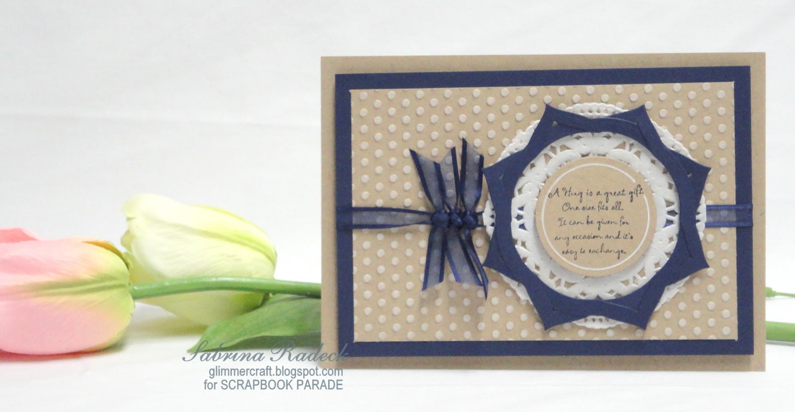
And for the last card,


a dark blue or navy was my choice to use with the Kraft. And even though I used a doily on the card, I think it would pass for both a feminine or masculine card. The background Kraft is dry embossed using a dotted folder and then a white pigment ink pad to ink the raised surfaces of the dots. The blue frame around the sentiment circle is created by die cutting two Spellbinders Nestabilities Labels Three, and tucking and overlapping them to create an entirely different shape. Both the frame and the sentiment circle are popped up with diamensionals, as is the matted dotted background piece.

So that's it for these five cards. Thank you for stopping by to have a look, and I hope you are inspired to create something new for yourself. Happy crafting!