Runway Inspired Challenge and Simon Says Stamp

I finally participated in a Runway Inspired Challenge (see graphic below)!

I was very excited by the concept when Jennifer first mentioned it, yet this is the first I've been able to coordinate a project for it. I was inspired by the colors and dots. (I had a difficult time determining the colors... I went with red, white and blue though, in retrospect, I believe it looks more like white, red or pink and gray?)


I was hoping the red in the background would show up better than it did. Starting with white cardstock, I used a Cover-a-Card stamp from Impression Obsession with Versamark ink and then Pure Poppy ink and did some clear embossing. The red looks a little pink-ish. I inked the background with Faded Denim and Chipped Sapphire to turn the panel blue.

The Paper Smooches sentiment was stamped on a double-ended banner die cut and wrapped with twine a-la-Lynn Mangan. Love her (prolific) CAS style!

I have tons of Cover-a-Card stamps that I really need to use more often

I've also entered this in the Simon Says Stamp Anything Goes challenge!

Thanks for peeking!


{Supplies}
  • Cardstock: Stamper's Select White (Papertrey Ink)
  • Stamps: Sentiment Sampler (Paper Smooches), Gradation (Impression Obsession)
  • Ink: Versamark (Tsukineko), Faded Denim and Chipped Sapphire Tim Holtz Distress Ink (Ranger), Pure Poppy (Papertrey Ink)
  • Dies: Double-Ended Banners (Papertrey Ink)
  • Other Tools: clear embossing powder (Filigree), Denim twine (The Twinery)

Colour Create Challenge #91 DT Inspirational

Mina is the hostess for Colour Create Challenge #91 for the next couple of weeks, and chose the colours gray, yellow, black and white. Mina also chose as the optional part of the challenge to add flowers to the project. I love the colours of light yellow with gray. In the mid 80's I had a kitchen that needed a face lift and guess what colours I chose? Yup,you have it, a pale yellow and light gray! It ended up being one of my favorite kitchens. Here is the inspirational photo that Mina chose for our challenge.

And the prize for the month of March is provided by Wenche and the online KORTHOBBY store. SO if you enter both March challenges, you have two chances of winning!


"I have been scrapping for several years. I do a lot of shopping abroad and often my shopping includes much more that I can use myself. That's why I got the idea to open an online store. Please take a look at my store at http://www.korthobby.no/ Hugs,Wenche"


And this is my DT inspirational submission for the challenge.


The funny thing is that in preparing for this challenge I discovered that I didn`t have a whole lot of yellow paper! I had a couple of sheets of a brighter patterned yellow, but had to resort to my scraps for a nice pale yellow.

I used Cuttlebug`s Asterisks dies to create the flowers. In the center I used the smallest size cut in gray and used black Enamel Accents to create a stamen-like look and added white Enamel Accents right in the center. I also used the Enamel Accents to frame the embossed yellow paper and the die cuts framing the sentiment.

The leaves are also a Cuttlebug die. I edged them with a gray ink and used my stylus on an old mouse pad to create the veins and give them a bit of a curl.

In case you are wonder what embossing folder I used on the pale yellow background, I purchased this paper about two and a half years ago at a Dollar store in Calgary.

I debated whether or not to include this next photo or not, because I got too close in taking the photo and therefore the image came out fuzzy. I wanted you to see the card form the side to see how the flowers and leaves work on the card. So here it is anyway.

Thank you for stopping by, and I look forward to seeing your design for this challenge at Colour Create Challenge. Stop in at the blog to check out the wonderful DT inspirational projects. Happy crafting everyone!


TOOLS AND SUPPLIES

SPELLBINDERS: Labels Six, Labels Fourteen, Petite Ovals large
CUTTLEBUG DIE: Asterisks, Leaves
STAMP: Micheal's .50 stamp bin
INK: Memento Tuxedo Black. Memento London Fog
Ranger Inkssentials Enamel Accents: White, Black

February VT Handout - Guarding the Hearth Tin Box Booklet


I forgot to post this earlier in the month!

It's time for another Visiting Teaching handout. These are made from tins that I just had to keep because I knew I could use them for something. You'll never guess where they came from. About three years ago my migraines were getting bad and the usual over the counter meds where no longer helping. The Dr put me on meds that came these adorable little tins that measure 2 5/8" X 3 1/2" X 1/2".

Of course February being the month of Valentines, the booklet boxes are in red and white with a blue accent and some hearts. Here they are!


Now, in case you're wondering about all those tiny little flowers...I didn't cut them for this project. I save them from my punches and Spellbinder pieces that are not part of the piece created. The tiny ones like these I keep in small ziplocs, and each shape has it's on bag.

Well, this was a fun little project to make and was well received. I think I should have taken photos with each step in the production, then you'd be able to see how I did it. I get so much into making my projects that I don't think about doing it. I'll have to try harder.

Thank you for stopping by and checking us out. Be sure to stop by Thursday for the Colour Create Challenge #91 and see what colours Mina chose for the next challenge. Oh, and check out the March prize, too.

Happy crafting!


Simply Jane and CR84FN 48

The moment I set my eyes on Papertrey Ink's Simply Jane stamp set (and dies and paper), I knew that I MUST have it! As most women tend to be, I am a huge fan of Jane Austen and the silhouettes and quotes on this set have such wonderful applications that I'm still swooning!

I completely loved CR84FN's color palette (see end of post) and used it to put together this card:


I accidentally put too much ribbon on the back/not enough on the front.  :(

The Handmade by stamp (which I love) was done at vistaprint.ca but obviously doesn't show up on dark cardstock, hence the sticker.


The interior of the card uses Big & Bold Wishes.

Thanks for peeking!


{Supplies--all Papertrey Ink unless noted}
  • Cardstock: Smokey Shadow, Soft Stone
  • Stamps: Simply Jane, Big & Bold Wishes
  • Ink: Brilliance Pearlescent Lavender and Versamark (both Tsukineko), Smokey Shadow
  • Dies: Simply Jane
  • Other Tools: ribbon (unknown), white embossing powder (Filigree), pearls (dollar store)

Colour Create Challenge #90 - DT Inspirational


It's time for another challenge at Colour Create Challenge! It's my turn to host the challenge and I chose the inspirational photo some time in December when we where all up to our ears in red, white and green for Christmas. So, I wanted to choose colours that were more reminiscent of spring. I thought of snowdrops and crocuses - white and light purple, so when I came across this image I thought it to fit the colours and also inspire simplicity.

The challenge is to use this photo for inspiration using the colours of lilac, white, blue, and kraft, with the option of including a paper charm that you make yourself; preferably one with a little dimension to it.

This is my DT Inspirational design for the challenge.


The stripes on the right are 3/8" strips that I cut, lightly ink distressed, and placed side by side, as an element taken from the inspirational photo. I think the clean straight lines of the stripes work well in contrast to the lacy print on their left. After lightly ink distressing all but the white behind the patterns and the white base of the card, I assembled the card front and used a seamstress's tracing wheel to perforate around the edge.

I used the Forgetmenot digi print as my blue for the challenge and printed two. All the lightest blue blossoms I cout out of the second copy and popped up with dimensionals over the first print.


I did the same for the little bundle of flowers that I used for my optional charm.


At the top of the digi print I tore the white, and then the kraft at an angle. I then wet the torn edge with a wet paintbrush and using the bristles of the paintbrush distressed the torn edge even more. I dried it with my heat gun while slightly curling the edge. When dry I took my ink blending foam tool and lightly inked the tron edge with Tim Holtz's Distress Antique Linen.


The charm, after stringing it, I attached to the bow using a pearl pin with additional pearl beads.
Here is the card again.


I didn't use a sentiment on the card, because I want to add it later when I use the card. My plan is to stmp the sentiment on a tab to be placed on the right of the image under the charm, or on the left, depending on the length of the sentiment. This could be used for a number of cards - Mother's Day, Easter, Birthday, Get Well, Thinking of you...

I invite you to go to Colour Create Challenge and check out the other DT members' inspirational projects for this challenge. Thank you so much for stopping by and leaving your comment.


TOOLS & SUPPLIES

Ink: Tim Holtz Distress-Antique Linen
Ink Blender/Foam Sponge
Seamstress Tracing Wheel 
Paintbrush & water
Paper Piercer (for the hole in the paper charm to feed the floss through)

PTI 5th Anniversary: Day 9

Another card challenge over at Nichole's blog in celebration of Papertrey Ink's 5th anniversary. We're asked to incorporate leaves and butterflies into our project. Too easy!

I used the Vines border die and the Butterfly Dreams stamp set/die for my card.


I ran out of 1.5" Xyron tape just as I was running my vine border die-cut through it. I resorted (gasp!) to craft glue to assemble my project. ;)

I used Sweet Blush on Sweet Blush, a technique that I've been meaning to try for ages. The butterfly was die cut out of Vintage Cream felt, as well as Sweet Blush cardstock (for a stiffener). The cardstock was stamped (not shown) and then scored down the center. The felt was sprayed with Viva Pink Glimmer Mist and glued onto the cardstock. I added rhinestones, shaped the butterfly and glued it onto my vines.


{Supplies--all Papertrey Ink unless noted}
  • Cardstock: Sweet Blush
  • Stamps: Butterfly Dreams
  • Ink: Raspberry Fizz
  • Dies: Butterfly, Vines border
  • Other Tools: Vintage Cream felt, rhinestones (dollar store and Recollections), Viva Pink Glimmer Mist (Tattered Angels)

PTI 5th Anniversary: Day 7

Today's challenge at the PTI 5th Anniversary celebration is to incorporate hearts into a design. Fits perfectly with my intended Valentine's Day project for the kiddies! Using Maile's Wine Bottle Tag die, I'm creating (very simple!) door hangars for each of their classmates.


I have a bunch of those background circle/scalloped circle combos from last year's valentines.

Perhaps I will add some Glimmer Mist on the rest of these babies...  ;)

Thanks for stopping by!

Happy Birthday Suzie!

Today is Suzie's birthday! She is on the same DT with me at Colour Create Challenge. I wish her the best birthday with lots of family, friends, and love on her special day, and a great year ahead.

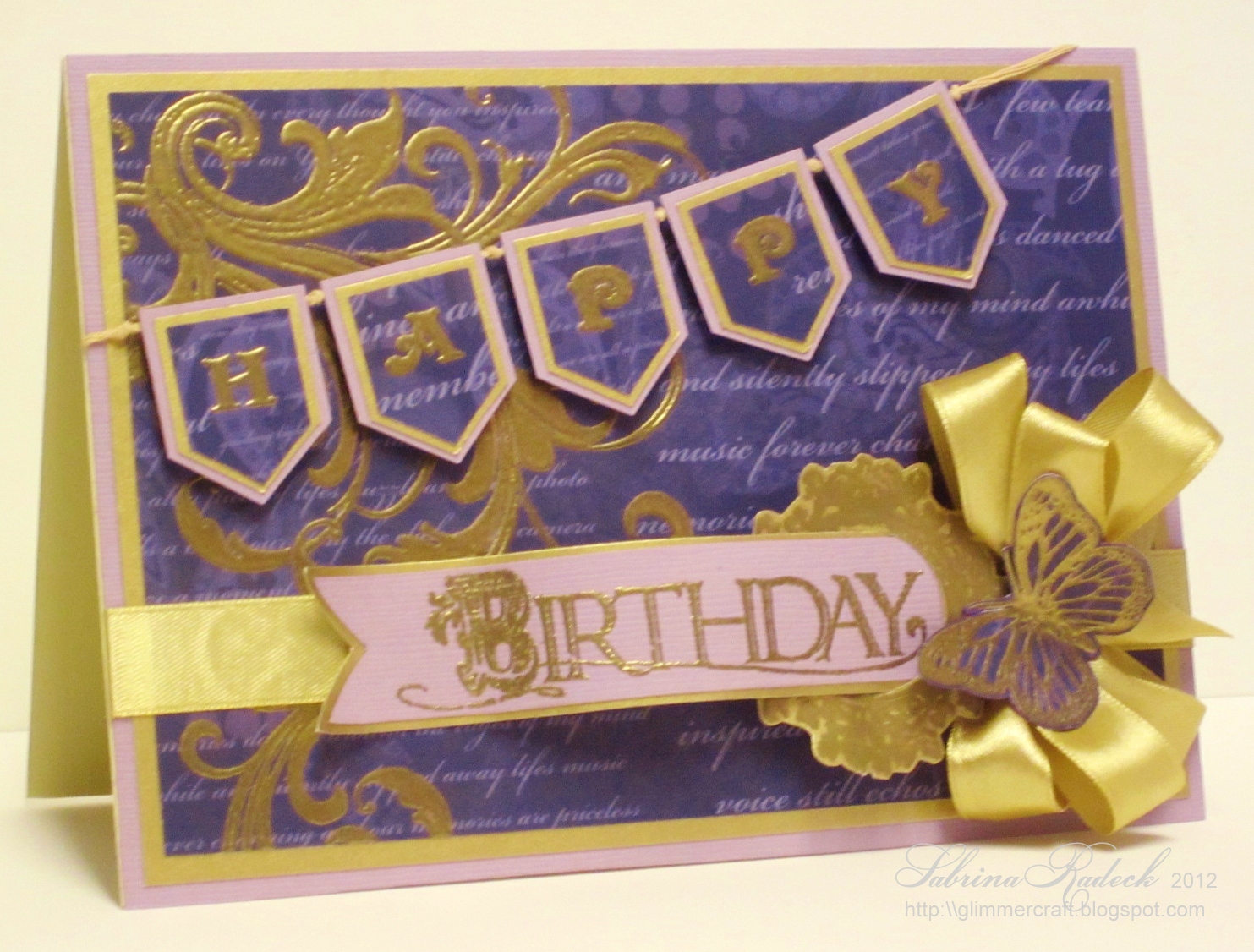
In trying to come up with  a plan for this birthday card my thoughts lead to trying to come up with colour combinations I hadn't yet tried. When I thought of purple and gold, I went to the web for inspiration and came across this royal purple and gold wedding invitation (right). Talk about elaborate! You should check out al the images in your search engine under "purple and gold"! Wow!...

The thing that really gets me is that my deep purple came out more of a deep blue in the photos. No matter how many times I retook the photos, or played at tweeking them. So I had to leave them as is at this point. My pruple is between the purple of the inspirational photo and the photos below. Even the smokey mauve isn't quite like in real life. But it is still a very rich looking card.


I don't have any banner or banner pendant dies, so these I cut myself. Keeping in mind that quality jewelry, if stung, has knots between each pearl, stone, etc, I did the same here in between each banner pendant. I used a lot of gold embossing powder. Originally I had thought I'd use Gold Liquid Pearl, but when I got to laying everything out before attaching it all together, I realized it would be way too much. I see that I forgot to colour the white double layered dimensionals with my gold gel pen...

Again, Happy Birthday Suzie! Lots of birthday hugs too!

Thank you, everyone, for stopping by today, and let me know you stopped by, OK.


PTI 5th Anniversary: Day 6 and CR84FN

The PTI countdown projects begin at Nichole's blog! The 5th Anniversary challenge for today involved 5 sketches to choose from. I LOVE THEM ALL!!

I tried a few different things (and actually threw out my first attempt--something I've rarely, if ever, done--probably something that I should do more often...  ;)  ) before I decided to go with the simplest sketch (pictured below).


I figured out that I can take decent indoor shots (good for night hours or blizzard conditions) if I play around with the lighting in my craft room, hooray!

I used the color combination over at CR84FN.

Don't be surprised if I use more of these sketches in the future!


{Supplies--all Papertrey Ink unless noted}
  • Cardstock: Stamper's Select White, Sweet Blush, Spring Rain
  • Stamps: Garden of Life
  • Ink: Memento Angel Pink and Tuxedo Black (Tsukineko), Pure Poppy
  • Other Tools: Sweet Blush saddlestitch ribbon, sewing machine/thread, button (unknown)/embroidery floss, Clearstar gel pen (Sakura)

Papertrey Ink 5th Anniversary: Day 5 and Simon Says Stamp

Today's challenge at the PTI 5th Anniversary celebration is to make a project using a photo from Pinterest as inspiration.

Here is my card:


Here was my inspiration:


Feel free to check out my inspiration boards on Pinterest here!

I'm also entering this into the current Simon Says Stamp challenge: Love is in the Air!

Thanks for stopping by!


{Supplies--all Papertrey Ink unless noted}
  • Cardstock: Pure Poppy, Stamper's Select White, Raspberry Fizz, Hibiscus Burst
  • Stamps: Fillable Frames #12
  • Ink: Versamark (Tsukineko)
  • Dies: Heart Prints, Edgers #3
  • Other Tools: Corner Chomper and Big Bite (We R Memory Keepers), eyelet (American Crafts), Rustic Jute Button Twine, mini-clothespins (dollar store), white embossing powder (Filigree), scoreboard (Martha Stewart)