Today I'm showing you some pretty bold colours complementing a bold red in these cards. There are only fours cards for this particular Colour Series class as we have a lot of work to cover in three hours for these four cards. Usually I have five to six cards.
This first one is a favorite colour combination, for most, when it comes to red. I just changed the dynamics a bit.
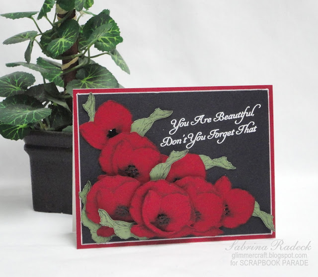
These poppies are stamped onto Bazzill Brick using MFT Inspired By Flower Set 3. And the leaves onto a green I can't recall as it was stamped on scraps. All are fussy cut out, which my class will moan over, and the foremost one is even built up with a couple of layers. I used a white gel pen to go around the edge of the black and make it pop. The Poppy centers are filled with dots using Enamel Accents in black.
This photo shows the layering of the flowers and leaves. Oh, and the sentiment is heat embossed in white.
This next card is very basic, but we are making the rosettes on this card from scratch using 5 flowers punched with a flower punch for each of the two roses, and a single flower for the bud.

(the photo I took head on was too blurry to post)
I used MFT Die-Namics Oval Open Scallop Doily Duo, with the larger one in red, and the smaller for the sentiment also from MFT called Lisa Johnson's Designs Gift Card Greetings II. The beautiful patterned paper is from Basic Grey-True Love-Love's Garden.
Because I cropped a small section of the photo, it is a bit grainy, but you can see the rosette and the leaves. I used Martha Stewart's Rose Leaf punch and inked the edges with VersaMagic Oasis Green.
In the next photo you can see the layers of this card.
The third card is a fun one to make because you can customize the number die cut in the tag.
The dotted paper is from Echo Park-Sunshine-Sunshine Words. The dies used for this card are all from MFT. Die-Namics Rounded Banner STAX, and High-Rise Numbers. The Bazzill Brick I embossed using Spellbinders M-Bossabillities Enchanted. I used one of my favorite ribbons, Crepe, to create what looks like a bow, but in reality is a series of loops at differing angles and lengths attached to a little strip of cardstock covered with Scor tape from both sides. One side to attach the ribbon, the other to attach to the card.
Here is a side view.
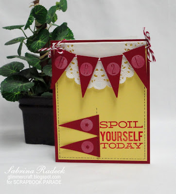
For the final card, I went with yellow to go with the red making this a bright, cheerful and warm card.
Once again I turned to MFT stamps using Clearly Sentimental Gift Card Greetings and ColorBox Cranberry ink, and VersaColor White. The faux stitching is done with a black gelly pen.
In this shot you can see the layers in the construction of the card.
Well that's it for this set of cards for the April Colour Series class. Thanks for joining me today to view the latest. Happy papercrafting everyone!


No comments:
Post a Comment