Wedding Card

I went back and forth about purchasing Papertrey's Shutterfly Special stamp set/dies but my brother's looming wedding pushed me over the edge into the affirmative. Such a simple way to create wedding cards (among others)!


 While I rarely adorn card interiors, it's definitely necessary with vellum!


{Supplies--all Papertrey Ink unless noted}
  • Cardstock: Vellum, Stamper's Select White, Autumn Rose
  • Stamps: Shutterbug Special, Heartfelt Basics, Fancy Flourishes
  • Ink: Memento Tuxedo Black and Versamark (Tsukineko), Autumn Rose, Sweet Blush
  • Dies: Shutterbug Special, Labels 23 (Spellbinders)
  • Other Tools: clear embossing powder (Filigree), ribbon (dollar store), Bow Easy (Posi Bendr)

CASE Study: Signature Style

For CASE Study's 2 year anniversary, they are celebrating with a challenge to create a card using our own signature style. While I try to use different techniques and styles, I'd have to say that my foundation style is super CAS. No embellishement, no nonsense.

Here are two samples using the same stamp...

One layer:


Slightly more embellished with an added layer:


I love paper-piecing!

These are little 3 3/4" square cards. So fun and simple!

Thanks for visiting!


{Supplies}

You Are So Nice
  • Cardstock: Stamper's Select White (Papertrey Ink)
  • Patterned Paper: Bright Side (My Mind's Eye)
  • Stamps: Vogue Abode and Word Salad (Paper Smooches)
  • Ink: Memento Tuxedo Black (Tsukineko), Soft Stone (Papertrey Ink)
  • Other Tools: Copics, Black Enamel Accents (Inkssentials)
Miss You
  • Cardstock: Vintage Cream (Papertrey Ink)
  • Patterned Paper: Bright Side (My Mind's Eye)
  • Stamps: Vogue Abode (Paper Smooches)
  • Ink: Memento Tuxedo Black (Tsukineko), Soft Stone (Papertrey Ink)
  • Dies: Sending You (Papertrey Ink)
  • Other Tools: Copics, sewing machine/thread, Glossy Accents (Inkssentials)

G45 Travel Case & Mini - Scrapbok Parade Class

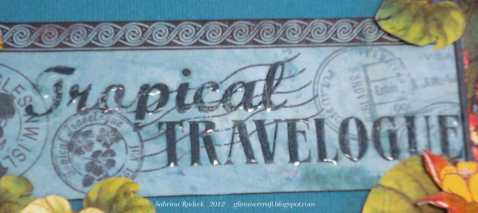
G45 has some of the most beautiful papers to be had. Tropical Travelogue is one of those gorgeous paper collections.

For this September class project I used a Darice paper mache travel case and made something real fun with it! I took over 150 photos for this project, so there is no way I can post them all! I've made a YouTube slide show that you may view at the end, and will just include a few of the photos on this post.


You may be wondering why the palm trees are upside own. Well there's a method to my madness.


Now it's not upside down! Let's open up the case, shall we?


Ta da! The case originally did not have that front compartment. I didn't want the mini to be sliding around, and I thought it would be nice to have an area to include things such as maps, a bottle of sand from the beach, sea shells picked up, or little trinkets purchased on your vacation. Whatever else you can think of too!


This map could be used for journaling, adding a few more photos, ...whatever else you can think of.


Here is what the case originally looked like.

OK, enough of the case. Let's take a look at the mini.


Don't you just love all the bright tropical colours!


You may see some glare. Some of it is from the Glossy Accents I used on some of the flowers and the text. You also see a shine of transparency behind the woman. It is there to keep the umbrella pole from breaking. Here are a few few more detail shots.


I'm going to show you just a few of the pages, and then you may go to the YouTube link to view all of it.


So, these are just a few of the pages, as I already said. When you view the YouTube slide show, you should know that the music wasn't long enough for the length of the slide show and tapers off a little  past half way through. There is no way to fix it as I can only use one track per slide show, sorry. So here it is for you to view.


Thank you for stopping by to have a look at my latest mini project. Happy crafting everyone!


New Digs

A friend of mine recently moved so I couldn't resist using my Paper Smooches Vogue Abode for a card to go along with a housewarming gift!


I pulled out my Bright Side paper pack from My Mind's Eye to some paper-piecing. I usually avoid buying patterned paper because I have so much and rarely use it. I could hardly resist this pack, however, with it's vivid colors and trendy patterns!

Thanks for peeking!


{Supplies}
  • Cardstock: Stamper's Select White (Papertrey Ink)
  • Patterned Paper: Bright Side (My Mind's Eye)
  • Stamps: Vogue Abode and He Said, She Said (Paper Smooches), Very Vintage Labels No. 2 (Waltzingmouse Stamps)
  • Ink: Pure Poppy and Soft Stone (Papertrey Ink), Memento Tuxedo Black (Tsukineko)
  • Dies: Labels 2 (Spellbinders)
  • Other Tools: Black Enamel Accents (Inkssentials), sewing machine/thread, Copics, black Spica (Copic)

Too Late for Casology

Once again, I am late to enter a challenge that inspired me. The new Casology blog is fabulous for me, giving but a single word by way of challenge. I am not in danger of taking a sketch or photograph literally or being limited by color and enjoy having such an open project.

This last challenge was the word "Bird." I immediately wanted to use my Little Bitty Bird Additions from Papertrey Ink. Here is what I came up with:


I'm still considering covering my colored grass with punched border grass. Meh, whatever.

Thanks for peeking!


{Supplies--all Papertrey Ink unless noted}
  • Cardstock: Stamper's Select White
  • Stamps: Little Bitty Bird Additions
  • Ink: Memento Tuxedo Black and Summer Sky (Tsukineko), Blueberry Sky
  • Dies: Little Bitty Bird Additions, Little Bitty Bird
  • Other Tools: Copics, Black Enamel Accents (Inkssentials)

CAS Thank You

A quick thank you card using the same stamp set as this project. Kept it flat and simple for mailing.


 Added a scored border for interest along with the rhinestones.

Thanks for peeking!


{Supplies}
  • Cardstock: Stamper's Select White (Papertrey Ink)
  • Stamps: Morocco (Basic Grey), Think Big Favorites #5 (Papertrey Ink)
  • Ink: Memento Tuxedo Black (Tsukineko), Peacock Feathers Tim Holtz Distress Ink (Ranger)
  • Other Tools: scoreboard (Martha Stewart), clear embossing powder (Filigree), rhinestones/iRock (Imaginisce)

Boy and Girl Baby Cards

When I pulled out my stamp for this project, I came across a Basic Grey set that has survived multiple purges. The recent baby challenge at Runway Inspired Challenge inspired me to use the elephant stamp.


I had first thought to use the tiny buttons that are on the bows for the elephant eyes. Unfortunately, it looked quite strange and so I just glued them onto the bows.

I'm entering this into the current Young Crafter's Unite challenge: buttons.

Thanks for peeking!


{Supplies}
  • Cardstock: Rustic White (Papertrey Ink)
  • Stamps: Morocco (Basic Grey), Bundle of Love (Papertrey Ink)
  • Ink: Memento Summer Sky and Angel Pink (Tsukineko), Kraft (Papertrey Ink)
  • Other Tools: bows/buttons (Recollections)

New York Redo

I love this stamp from Penny Black. (This one and this one, too.) I justified purchasing the New York stamp because it happens to be an obsession of a friend. I thought it would make a lovely birthday card for her! (I can justify London and Paris, too!)

My first attempt at a card fell flat. It's a difficult stamp to work with; I didn't want to color it in. I decided to go for a monochromatic, rustic look but didn't like the colors I chose to ink the edges with. Messed it up quite a bit, too.


Rather than waste time trying to fix it/embellish it, I started anew.


Love these Label 23 dies from Spellbinders! I made the card base from the Grands. I inked the grass with Shabby Shutters and the sky with Weathered Wood. Using a Qtip, I filled in the trees and topiaries. It's difficult to tell in the photograph, but I used Glossy Accents on the girl to kind make her stand out. I messed up while stamping the sentiment and so sewed a strip on to cover it up. Draws more attention to it anyway. ;) I love the colors on this one much better!


{Supplies}

Attempt #1
  • Cardstock: Kraft, Fine Linen, Rustic Cream (all Papertrey Ink)
  • Stamps: New York (Penny Black)
  • Ink: Kraft (Papertrey Ink), Vintage Photo and Walnut Stain Tim Holtz Distress Inks (Ranger)
  • Impression Plate: Sunrise (Papertrey Ink)
New York
  • Cardstock: Rustic Cream (Papertrey Ink)
  • Stamps: New York (Penny Black), Gracious Vases (Papertrey Ink)
  • Ink: Kraft and Dark Chocolate (Papertrey Ink); Shabby Shutters and Weathered Wood Tim Holtz Distress Inks (Ranger)
  • Dies: Grand Labels Twenty-Three (Spellbinders)
  • Other Tools: Glossy Accents (Inkssentials), sewing machine/thread, decorative scissors, clear Spica (Copic)

September Monochromatic Cards - Scrapbook Parade Class

With Autumn not far off, I think of the deep blue skies, the changing greens, oranges, and browns. So those are the colours I chose for the four Monochromatic Card colours of September's class.


Beautiful colours, are they not!

Let's talk about the the blue card first. Here it is.


To emboss the background on this beautiful Bazzill Bermuda Blue, I used Spellbinder's Nestabilities Splendid Circles (S4-354), every one of the circles to create the circle pattern. Then I off-set it with Hero Arts Cling Large Flower stamped twice with Tim Holtz Distress Stormy Sky ink pad and used Ranger Inkssentials Cut-n-Dry brush lip pen nibs and more Stormy Sky with Broken China to colour in the flower a bit.


I added Waterfall Stickles in the center of one of the two flowers I cut out. The top one I cut to nearly the center of the flower so that I could shape and form the petals as well as have each petal glued down on one side and popped up on the other. Hopefully you can see that in this next photo.


Net we have the changing green of fall as depicted in this next card.


For this card I dug into my bin of green paper scraps and used Cuttlebug's Fall Leaves die set to cut out a variety of leaves from the scraps. I then applied Tim Holtz Tea Dye around the card background edges and the edges of all the leaves. The sentiment stamped with Momento Rich Cocoa is Flourishes Life Lines.


The leaves are both glued and layered with Quick Dry glue and pop-dots. Maybe you can see that better in this next photo.


Now let's have a look at the orange Bazzill Tangelo card. I love the simple design of this card.


This is a simpler card where I inked the edges going more to the center with Tim Holtz Tea Dye and then just a little right on the edge with the actual ink pad of  the Walnut Stain ink pad. The stamps from Stamp'n Up French Foliage (leaves and script) are stamped using Momento Rich Cocoa as well as the "gratidue" sentiment (unknown) on the tag. The leaves were then hand cut out and a little Copper Stickles where used to draw more attention to the leaves.

 Unfortunately the blurry photo doesn't show it off, but I hope you can see some of the script stamp and leaves. on the tag I punched a small circle and then punched a circle in the center to make it look more like a real tag.

And lastly, we have our brown card. I was a little disappointed with the card, as I saw it differently in my mind's eye.


For this card I used Bazzill Carob cardstock and heat embossed with Tsukineko Copper. The edges on the card I applied some VersaMark with a VersaMark pen and covered with the embossing power, heated, and ta da!
The stamps are part of an unknown Autumn set I picked up somewhere. I just love those oak leaves and acorns! Isn't it amazing that I've had ribbon, for a couple of years now, that just happened to match the card!

Hope you enjoyed your visit with us today, and thank you for stopping by and please feel free to leave your comment or ask any questions. Happy Crafting everyone! There are lot more projects to come, and I can hardly wait to post them, ...but I have to finish them first!