Showing posts with label holidays - fathers day. Show all posts

Happy Father's Day

I whipped up a quick card for the father of my children, who dreams of all things tropical!


I used 3 different Waltzingmouse sets here:  Man of the Hour (love!), My Island, and Woodgrain (that banner fit perfectly over the Man of the Hour sentiment!). My guy is simple, and the paradisaical stamping put a smile on his face. ;)

Happy Father's Day, daddies!


{Supplies}
  • Cardstock: Kraft (Papertrey Ink)
  • Stamps: Man of the Hour, My Island, Woodgrain (all Waltzingmouse)
  • Ink: Classic Kraft and Dark Chocolate (both Papertrey Ink), Versamark and Memento Tuxedo Black (both Tsukineko)
  • Other Tools: clear embossing powder (Filigree)

Father's Day and More Organization Tips

The "Man of the Hour" stamp set from Waltzingmouse Stamps is one of my favorites!


I actually used my glue gun for the button/ribbon embellishment! I'm scared to death of glue guns but I couldn't see any way around it. I have the cordless Imaginisce one and it wasn't too bad at all! ;)

I'm entering this into Simon Say's Stamp masculine challenge as well as CAS(E) This Sketch. I kind of flipped the sketch.

And the inside (a rare consideration for me):


I thought I'd share another couple of crafty org tips.

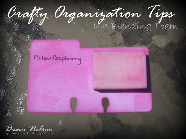
I used PTI's Desktop File Card dies to organize my ink blending foams:


I inked each color and used a tiny piece of Velcro to adhere each roam.


To organize my buttons, I use IKEA plastic organizers (discontinued?). I don't need a ton of spice jars taking up space!


Each divider is adhered to the bottom using dimensional adhesive--a tip suggested by my mom to keep the buttons from moving between sections.


And, of course, no organizing project is complete without labels!


Thanks for peeking!


{Supplies}
  • Cardstock: Dark Chocolate, Vintage Cream (both Papertrey Ink)
  • Patterned Paper (interior): Studio Calico
  • Stamps: Man of the Hour (Waltzingmouse), Distressed Corduroy (Impression Obsession)
  • Ink: Dark Chocolate and Kraft (Papertrey Ink), Versamark (Tsukineko)
  • Dies: XOXO (Papertrey Ink), Stitched Mats - Squares (Li'l Inkers)
  • Other Tools: Dark Chocolate button and grosgrain ribbon (Papertrey Ink), Rustic Cream button twine (Papertrey Ink), clear embossing powder (Filigree)

Blues & Browns Masculine Vintage Layout

- a little late getting out, but a class I'm looking forward to teaching.

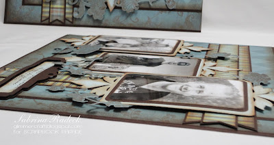
It's time again for the Vintage Layout class at Scrapbook Parade. Since Father's Day is this month I thought it would be nice to create a masculine layout again. The papers used are from the retired Upsy Daisy company using the 'Man About Town' collection. I used the blues in the line along with some dark brown.


I was inspired to use my Cricut for this layout, using the Heritage cartridge. It will be a time saver in preparing the kits for this class.

All but the fussy cutting of the floral flourishes are ink distress with Tim Holt Vintage Photo. I even used it around the edges of the photos.


Normally I would have used a brown marker to edge the fussy cutting so that the white paper core doesn't show, but I was in a time crunch here. So if you do something like this, I recommend that you do it. It looks so much better.


Here are some close ups to see all the parts that I popped up. Yep, I even use dimensionals on my layouts. Just can't help myself! I just like the look.


Hope you enjoyed this layout. Thank you for so patiently looking at all the photos. I have so many for those that can't take the class and have a kit. These detailed pics help them to put their project together.

Till next time, happy crafting!


Father's Day Cards

- getting ready for the fathers, husbands, sons, and brothers that are dads

I always love making Mother's Day and Father's Day cards. As a matter of fact I remember that it was the case even as a very small child. But, we're not here for me tell you stories of my childhood. These four cards are for a Scrapbook Parade class coming up in early June. So why don't I show them to you.

These are the four cards we'll be making. To begin, we shall have a look at the card on the left, a vintage look.


You can see that I even did a little something on the inside of the card. For the outside, I used Fancy Pants' "Swagger - Powerful" and Tim Holtz Vintage Photo Distress ink to colour the pattern paper and age it. The three stamps are "Inspired By Travel" from MFT and stamped with the same Vintage Photo ink.

To get the corners this way I used a 1/2" circle punch and placed the corner in 1/4 of the circle and punched.

For the second card, I again used Fancy Pants' "Swagger - Success" this time.


After die cutting the circle, I edged it with both Weathered Wood and Tumbled Glass Distress inks from Tim Holtz. I used a nib and the same inks to create a water look at the bottom of the circle. The sailing ship is a stamp from MFT "Inspired By The Sea". I stamped it, colored the waves showing at the bottom of the ship and in between the sails, and then cut it out and popped it up on the circle with dimensionals. Here's a closer look at it.


I decided to try and remember how to make a Macrame Sailor's Knot, which took me a while, and use that on the card for something different. I love the look and know that I figured it out I realized that I could have checked on line, silly me. I like it a lot and will do it again and maybe investigate some other macrame knots that could be used on a card.

Here's a close up of the knot...


...and a view from the side so you can see the layers.


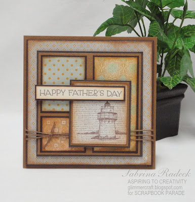
For the next card, I wanted to make a square card. This one has a lot of paper layers and popped up layers, and has just a hint of a vintage look.


I really like this one. For this card I used Authentique's "Strong" paper from the 6 x 6 pad with some coordinating Bazzill cardstock. The stamp is from MFT titled "Inspired By Lighthouses". I just stamped it onto the designer paper and love the look. I again used Tim Holtz's Vintage Photo Distress ink for both the stamping and the edging of the paper.


Hopefully you can see the layers here. 

And for the last Father's Day card, I wanted to be a little more playful.


I again went to the Fancy Pants' Swagger - using "Mustache Fever" & "Gallant". Added the pewter brads and used MFT's Die-Namics Tool Charms.

Well, that's it for this set of class cards. Hope that you are getting some inspiration for your Father's Day cards. Thank you so much for stopping by to have a look. Happy papercrafting!


Lighthouse in a Clock!

- a Father's Day project for a June class

This is a real fun project to make for a fun gift for a special man, and ideal for Father's Day. You've heard of a ship in a bottle, right. Well, when I saw Tim Holtz's new clock, I thought lighthouse in a clock! Don't ask me how that thought came to be, it was just there. So this is the end result.


White capped waves in layers with a lighthouse silhouette laser cut from black chipboard. Because of the shape of the clock, as you get closer to the front glass, the circle narrows a bit. So, I had to make different sized circles for every two layers. I cut  total of three layers using the top and bottom of each circle to create six layers of waves. Each wave sequence I drew is different.

Before I tell you more, why don't you have a look at some of the photos.


The anchor and ship's wheel are also laser cut from black chipboard, but I then heat embossed them on both sides with silver.


Now, let's take the back off and show you more.


To get the whitecaps I used my little Studio gesso bottle and gently squeezed out a little and in small circular motions while spreading it around. You can just barely see the shine reflected from the Glossy Accents that I applied in the same way.

Here you can better see the layering.


I tried to load the short video for you to view, but for some reason it's not working today. So I'm trying to link you to YouTube so that you can view it. http://www.youtube.com/watch?v=bPHZP7lqknk
Hopefully this will work.

Thank you for stopping by to have a look. Happy papercrafting everyone!


For The Men In Our Lives

...so fun to make masculine cards

I'm back! I've had a pretty busy few days with a two day class, some very detailed project classes and a couple of others that I had to make kits for, etc. So, today I'm back with a new class for the end of May. A masculine card class. We should do that more often, because I forgot how fun they can be to make.

The cards for this class all measure 3 3/4" x 8 1/4". They are black exterior with a white interior and come with charcoal envelopes. Each package has five in it, so each person gets to make 5 cards in class. I based these cards on some of the elements that men like or associate with in their life. Leather, wood, stone/brick, metal, and the sea. These are they.


I have two favorites, and will start and end in showing them to you. The first is one that make you think leather, and maybe jungle.


I used the old Cuttlebug embossing folder "Mosaic Tiles" and since the paper was considerably longer than the folder I had to turn it and emboss it again. By not going over the edge of the folder, I was able to keep the inevitable 'edge bump' from appearing, and even matched the rows. The pattern will not match, but I covered that with the twill ribbon.

To get the leather look after using the embossing folder, I completely covered the paper with VersaMark ink and covered it all with clear embossing powder and heated it up until all melted.

Here is a closer look at that part of the card.

 
The leaves are actually from MFT Die-Namics Poinsettia which I cut up. The tag I cut out of chipboard using the store's Accucut. I then heat embossed it twice (2 layers) with copper embossing powder, and while still hot from heating, immediately placed my choice of clear stamp into the very hot embossed tag to give it that engraved look. The hemp cord I wrapped around one of my small brush handles and heated the cord with my heat gun to hold the 'ringlete' shape better.

On to the next card.

  
You guessed it. This is the 'wood' card. Again I had to trick the paper using a small embossing folder "Woodgrain" from Sizix.  The using Tim Holtz's Distress ink pad in Vintage Photo and passed it gently over the embossed wood grain to darken it. The maple leaves are from an old die from Cuttlebug that came with a little mini embossing folder to emboss the leaf edges and veins which I darkened with Tim Holtz Distress inks Shabby Shutters for the lighter leaf and Peeled Paint for the darker leaves.

Now let's check out the Stone/Brick card.


Here, too, I used a folder and had to trick the paper. But this time I inked the folder with a white ink before embossing it to help define the bricks and make it look more like mortar between the bricks. I punched out some tiny little hearts and used the white ink pad around the edges of the hearts.

OK. Let's have a peek at the 'metal' card. Another tall and skinny one.


I thought that I'd use the sophisticated black, gold and touch of cream for this one. I didn't have to fudge around with the paper on this one as the size fit into the folder nicely. Actually, it wasn't paper but Spellbinder's Precious Metals foils sheets and Cuttlebug's Script Texture embossing folder. I then sanded the gold off of the script to expose the silver underneath. I added a lot of tiny little gold brads along the side of this.

The MFT's DC Giftcard Greetings was gold heat embossed and then line framed using a ruler and gold Gelly Roll pen. I did the same with the banners.


And, now, for my other favorite, and last card of this set. The Sea inspired card.


I took some designer graph paper, second stamped the left corner, and inked the edges with Tim Holtz Stormy Sky. Using Spellbinders Standard Circles I created the lifesaver ring and attached the hemp cord while wrapping the blue ribbon around.


The waves I drew onto three different blues and cut them out. Then with some Studio Gesso I squeezed lightly out and spread around in a circular motion with the tip of the nozzle on the bottle. It didn't take long to dry, and that's when I used my Glossy Accents to quickly draw wave and added in a circular motion again, over the white caps I created with the gesso.

Each blue layer I popped up with some dimensional foam squares, and then added the lifesaver. Do they still call those ring "livesavers"? I always wonder beacuse of the candies. lol

So there you have the five masculine cards. Hope you are inspired to make your own masculine cards. Happy papercrafting everyone.