New Bullet Journal Set Up & Hello September


Hello bullet journalers!

I had to start my third bullet journal. I did have several pages left in my 2nd bujo, but not enough to set up an entire month, so that means starting another one. I was thinking about what I could do to make it a little different this time round. As a paper crafter, I have a few different alphabet die sets, and thought I should use them more often. Since the names of the months are longer come the end of the year, I knew that I would have to use my tall and narrow alphabet die set.

Perhaps I should have taken a close up photos of 'September' because you can not see the gold pen lines traced around the letters too well in this photo. I am hoping that this bujo will go through to the end of December, but as I am not sure of that I left the last month blank to add the letters later.


Now, the next thing that usually goes into the bullet journal is an index. I setup my usual three pages for that, but ended up making a mistake. I had to get up out of my chair to get my black pen for the entry of items into my journal, but while I was away, the page must have turned because when I finished entering everything I had done so far and went to turn the page to enter my 'key' symbols, I was surprised to see that the 'key' page was already there! I had to chuckle because there was no way I was going to fix this. I would have to have my index a little mixed up.


So here is the third page of my indexed filled in as the first page should have been.


It wasn't until after I filled in the entire year calendar, that I thought how silly it was to include months that had already passed. So, next time I think I will leave off the completed months and find a way to set it up to include the months of the new year in their place.


Since I am hoping this journal will go through December, I decided I needed to include January 2019 in my 5 month 'future log'. Five being an odd number, the best way to include them all on one page was to ignore the meeting of the pages and use it as if it was only one page. I was able to fit it all in that way.


So now I have the journal set up, it is time to set up the month of September. I went to my washi tapes for inspiration and ended up choosing the ones with gold, purples, pinks, and beiges. I also wanted to see if I could use some stamps too. I found my 'hello' stamp and decided to try heat embossing it in gold. that ended up being a mistake. I share the reason why in the next photo. I found my old gold ink pad so that I could stamp in gold. 


Here in this photo you can see the gold stamping better.


Now, turning the page you can see why it was a mistake to heat emboss on the previous one. The heat on the thin paper brought the embossing ink and gold bleeding through.

I went ahead and set up my calendar over it rather than covering it up.


Next is my 'Brain Dup' page. I love using the dotted grid to create gold dots along the edges of my washi tape. I decided to use the gold gel pen for the lettering of the title, too.


I always have to have my 'future classes & kit' log. Last month I only set up three sections on one page, but I ended up needing more than that, so I made sure that I set up 6 this time. I used my gold gel pen for this as well. I think once the photos go in of each set, it will look great with the gold.


Now comes my 'finances' spread. I used my usual layout with just a few minor changes. Again the gold dots, but this time on a gold line for the border.


Now comes the real daily usage part of my journal. When I started my first journal, I used a page folded in half to fit my weekly view into a double spread view. Well, I have found that I need more width to my weekly columns and decided to try a variation of that idea. It means that I need to use two pages to make it fit, and instead of fold the page in half, needing more width, I cut the page and included a tab design onto these two pages. This way I get my wider columns and and see my week in one view.


So, the benefit of this is that I can get away with creating only one monthly mini calendar that can be viewed as I turn the partial tabbed pages, and can access my 'notes' section more easily.


The last part of my set up for the first week of September, is my 'gratitude log' and my 'weekly expenses log'. I decided to give myself two lines for each day's gratitude entry. I sometimes had to squeeze it in, so that is why the change. By cutting down the size of the heading to just one line for both of these sections, not only gave a new look, but gave me the space to do the change.


The next couple of empty pages are for my daily journal entries, and ends with a weekly review.


Well that's it for the start of my new bullet journal and the first part of September. Oh, I ran out of gold ink in my pen, so I will need to get another pen.

Happy journaling!


2 Cards Out Of 1 Coloured Die Cut - Altenew Layered Blossom 1


Thank you for stopping by today. Today I am sharing with you two cards that I made from one coloured die cut. These are the two cards.


What I did was cut a 4 1/4" x 5 1/2" piece of white cardstock. At this point I had two ideas to choose from in proceeding. The idea behind this card came from Jennifer Mcquire's tutorial on 'Faux Stained Glass'.  I wanted to create this card using sponged ink colours, rather than the alcohol markers that Jennifer used. I thought I could achieve this in two different ways. 1) just ink blend the colours in the approximate areas, or 2) take out all the pieces and ink blend the pieces individually.

As I pondered this, I thought that I could get two coloured parts I could use to make two cards out of it if I did the first choice. So I went to blend ink colours in the approximate areas. I knew that this would mean the colouring would not be between the lines, but would be loose and interesting.

Once the colouring was done, I then die cut the piece. I kept the individual pieces separate from the frame and lines image.


So, beginning with this card (above), the next thing I did was die cut three more of this die in white cardstock, keeping only the lines & frame parts. I glued these three layers together, and then onto a  4 1/4" x 5 1/2" piece of white cardstock. Next, I glued all the inside pieces where they fit. Then to give it that Faux Stain Class look I filled in all the sections with Glossy Accents. It's amazing to see how it looks when dried.

In this next photo you can see the shine from the Glossy Accents and how it dried.


Here are the side views.


Now let's have a look at the second card made with this die cut.


So, for this coloured frame I had die cut three more layers of thick white cardstock. I like the look of the raised image, so I did not mind working on gluing the layers together. Here is a closser look at the layers.


I cut the backing a bit larger than the frame to give it a matted look, and added the second mat layer behind that.


So that is it for the two cards out of one die cut (sort of...).

Here is the Altenew Die for you to see.


Now you can go and see what you can come up with using the 'Faux Stained Glass' techniques.

Happy creating!


Colour Choice Improvement - Spellbinders Floral Oval


A few days ago I made this card, and I mentioned that the idea of white & navy did not quite work out with the darker green leaves & vines. It bothered me a lot, so I went and made another card with a lighter blue and lighter green. I am much happier with the colour choices. I think I will still try another one on navy, but just use a light green.

So here is the newer version of the card.


So what do you think? The colours are better right?


This time I added a few more flowers than I did on the previous card.


I am much happier with this card.

Happy die cutting and creating!


Wedding Card With G45 Floral Shoppe


As many of you know, one of my favorite things to do with paper is fussy cutting. There is something to be said about taking the flat paper and creating dimension with what you cut out of it. That is particularly true when it come to Graphic 45 collection paper.

My Dad and I attended a wedding reception of a grand-daughter from a dear friend. Because this family loves things Hawaiian, I thought a card filled with flowers would be the ideal thing for the bride. My mind immediately went to Graphic 45's Floral Shoppe. So one night I went through my scraps and 8 x 8 pad and watched a couple of episodes from a documentary series and fussy cut.

This is the card I made, minus the sentiment strip that I forgot to put on before taking the photos. The strip said "The Best Is Yet to Be". Any way, here is the card.


All the flowers on the front were fussy cut and attached, with the exception of a partial bloom showing on the right of the paper text. The 3/8" sentiment strip was tucked in just under the yellow bloom at the bottom and went across to partially covering the pink flower on the right. It mainly covered the leaves in that area.

I tried to get a close up of the fussy cut layered flowers, but you really can't see the details of it as well as I had hoped.


But, in the next two side views you can see it better.


I really wish I had not forgotten the sentiment strip for you to see, because it does add to the design of the card. Well there isn't much more to say about the card, but I do hope it inspires you to create something beautiful.

So till next time, happy fussy cutting! Happy creating!


More Experimenting with Spellbinders Floral Oval


Okay, so the last post was about playing with my new Spellbinders Floral Oval, and I used Fall colours. Today, I am not using all the pieces of the die set, just the leaf vines and the flowers. I glued the vines all over the card, cutting off what hung over the edges and using the cut off pieces elsewhere on the card till it was covered.

I am wishing now that I had used more of a sky blue, rather than the navy, and a lighter green for the vines. But I was thinking how beautiful white daisies look against navy blue. It just did not work out well for this card. I may try and make another card like this with those changes and see what the difference will be.

So here is the card. I made it for a friend, just to send for no particular reason.

If you take a closer look, you can see that I used a Q-Tip to add the yellow in the centre of the flowers, and pulled up the flower petals just a bit.


You can probably see that better in this next photo.


What I like about this, is that you get a little bit of dimension, without making it difficult to send in the mail.


Would you be interested in seeing this card again in the lighter blue and lighter green?

I love learning when I play and experiment. How about you?

Happy creating!


Still Playing With My Spellbinders Floral Oval Die Set


Hello Everyone!

I hope you week has gone well for you, and that you found some time to play and create. I have been playing around a bit with the Spellbinders Floral Oval die set. Remember my first card with this die set?

This time I created a landscape card and used fall colours and NUVO Mousse with that lovely metallic sheen and look. I am afraid that the metallic sheen does not always show up very well, but I will talk about that later. First let's have a look at the card. I used all the parts of the dies set for this card.


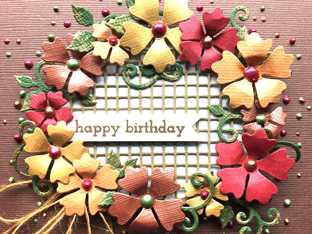
I do not know if you can tell in this next close up, but the 'brown' flowers are brushed with NUVO Mousse Cosmic Brown; the yellow flowers are brushed with NUVO Mousse Indian Gold, and the light orange flowers brushed with a little NUVO Mousse Fresh Copper. I did not have the Persian Red to try out on the more red flowers.


For the NUVO Crystal Drops, I used Metallic Copper Penny, Bottle Green, and Autumn Red.


As you can see I also brushed some Indian Gold NUVO Mousse on the leaf vines.


With the orange twine, I tied 2 bows and pinched each at the knot putting a mini-glue dot on the top and bottom of the knot and inserting it under the oval. By putting the two side by side you get a nice fuller look without having to worry about the thickness you would get from a ribbon bow.

I did create a second card, while playing with this die set, and I will show it to you another time. In the mean time...

Happy creating!


Check out the Floral Oval die set.


Requested Identical Thank You Altenew Card In Another Colour


I was asked by a friend if I could make a card exactly like one I had made before, but in Navy & Pink. The card I am referring to you can view by clicking here. It's the black & yellow card.

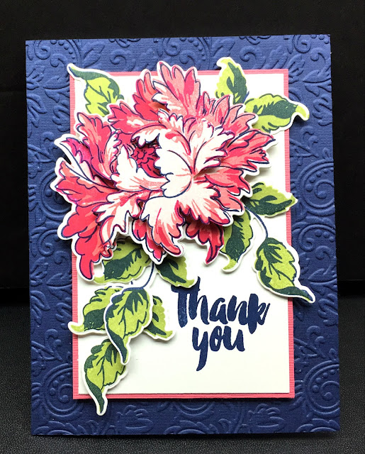
Here is the card I made for my friend.


So even though this card is the same as my black & yellow card, just the colour change makes the card look quite different. The one thing I noticed is that the light pink sold background stamp of the flower shows white in the photos. I guess the lighting faded the light pink out.

In the next couple of photos you can see the three layers of the bloom and how I cut them up.


From the next two photos, you can see from each side the layers of the entire card.


So, the original black & yellow card seems much more dramatic and eye catching than this navy and pink one. But it is still beautiful.

Which one is your favourite?

Happy stamping!