-Are you surprised? Sabrina making CAS cards? I do like CAS cards too, and was in a real good mood to make some, so I created a class around leaning toward the style.
For our June class we'll be focusing on using gold and silver metallic ink pads and a little more stamping. Normally we have 4 or 5 cards in a class, but a CAS class I thought we might be able to get a 6th one in. And here they are.


I first want to say that all the sentiments on these cards are fro one stamp set. Woodware Clear Stamps 'Heartfelt Christmas Wish', which you see to the right.
Let's begin with the red card. It is more common to see gold with red, but this time I decided we would combine silver with red to stamp this sentiment on the front of the card. A very simple and basic card that I think will appeal to both women and men.

Next on the list, again with silver, is this mainly white card using a technique that will be new to many taking these classes.


In dry embossing with the Cuttlebug Holly Ribbons folder and combining Darice Easy Frames, you can emboss your entire cardstock piece but leave a shaped smooth area for stamping. There are 7 different frames in the set (which you see to the left) and are designed for the A2 sized card. You can also trace the edge of the shape with a pen or stencil it with your ink blending tool.
Let's look at some colour in this next card.

Three different sized triangles embossed in three different patterns, look like trees. Spread a little Star Dust Stickles to add a little sparkle and you have snow covered trees! The sentiment in gold ink is stamped onto a strip of velum and wrapped around the corner.

The center tree has two layers of dimensionals, while the other 2 have only the usual one layer.
This next one is my favorite. Silver and white, and velum...

I used the bells stamp from MFT'S Inspired by Christmas set and stamped a background pattern onto white cardstock. I then fitted a piece of velum to wrap over the top and bottom to mark my stamping space and stamped the sentiment and bells on the velum with silver ink. (I wish I had stamped the image first, and the the sentiment for placement reasons) I just love this simple technique and look of this card.
A little more read again in this next card. This time using gold ink to go with it.
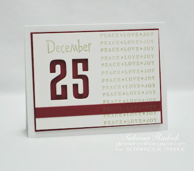

The number 25 is die cut out with MFT High-Rise Numbers Die-Namics and popped up to expose the red cardstock beneath. 'December' is from a very old and well loved Hero Arts stamp set, while the sentiment from Woodware is repeatedly stamped down the right side. The red strip is positioned so that the sentiment is stamped as if part of the others.
And the 6th and last card has a little lace-like look,

Here the card sentiment is stamped directly onto the card, while everything else is built up around it. I used Deco Shells and another older (I can't remember the name to, or find it out) Martha Stewart border punches in layering with green to get this look.

So there you have all 6 of the cards. Thank you for checking in to have a peek, and hope you are inspired to create some CAS Christmas cards of your own.
For July, and possibly August, you can look for some vintage Christmas cards!
Happy papercrafting!