Showing posts with label theme - congrats. Show all posts

Fun Chalkboard Cards

For the past few months I've noticed what seems to be a comeback for the  Vintage Chalkboarding style and techniques for not only restaurants and the like, but in printing invitations, cards, brochures, and so much more. Of course the handmade card industry picked up on this and has come up with a few techniques to apply in cardmaking and scrapbooking.

This is mainly using stamping, inking, and colouring techniques and after Googling Chalkboard art, I was so very excited to experiment with some  techniques. I had so much fun with it, I just had to have a class at Scrapbook Parade to share this fun style and some of the techniques I discovered.


So hear are the 4 cards we'll be making in class in early February.


There is a large card on the left (5 1/2" x 8 1/2"). Often people like to give larger cards than usual for Valentines, so I thought it would be fun to make a larger card. Lets have a closer look at it.


I suppose it could even be used for a wedding or anniversary.

Next is a congratulatory card with stars.


I think this one is my favorite one of the four. Next is a Birthday card and my 2nd favorite.


And lastly, a chalkboard "Thank You" card.


I had such a blast with this style of card. I now want a bunch of stamps to take this style a step further. So, are you inspired to try out this technique/style? Have fun with it.

For those of you taking the class in February, at Scrapbook Parade, here in Victoria, the list of what you need to bring is at the very end of this post.

Thanks for stopping by everyone, and happy crafting!


Read the "what to bring to class list" carefully.

-paper trimmer
-scissors
-pencil
-ruler
-clear stamping blocks
-stamps that will work for this techniques based on these class samples and what you've researched online
-VersaMark ink pad
-ink/stamp cleaning stuff
-
stamping Anti-static pad
-ink blending tool
-coloured pencils & pencil sharpener (pencils must be sharp as we use them)
-dbl sided adhesive
-quick dry glue
-dimensionals (pop-dots) black & white
-white gel pen
-small black ink pad or a black marker
-small hole punch


October Colour Series - Purple Velvet - Scrapbook Parade Class

I've had a very busy day today!! I've been working since 10:00 am and it's now 2:30 am! I've made the six A2 cards for October's Colour Series Card Class, as well as three of four Christmas Crackers for a future class, and started on the Advent! No wonder it's the next morning! I'm not a bit tired though. Having so much fun with this all.

I'm not going to write a lot of details for these six cards, but I do have more than one photo for each card so that you can see a few of the details.

Here is a photo of all six cards together.


So these are they, and I have about another 15 photos. Hope you don't mind. But I like to post each card and a one or more detail shots for those who can't finish the class and need a reference from home, or for those who buy just the kit.

So, the first one I'm showing you is the one with ruffles made from paper. I've done that before, here, and there's a link there to Claire Buswell's blog who shared the idea with a tutorial.


I just have to brag a little here. Those pearls you see on this card, the rest of them too, are Liquid Pearls! I think I did a great job on this one.

And a detail photo showing the three popped up layer and the ruffles.


Next we have the purple and bright green card with some ink resist.


Made a mistake on this card that I didn't want to take the time to fix. Since the card is on a cream card base and the snetiment is stamped on like colour, I used the same for the ink resist and once the colours soaked in it doesn't look right. I should have done it on white. the class will get white.

In this following photo can you see the three layers and the bowed sentiment banner?


Now comes the purple and brown with the huge bow!


A couple of detail shots for this card. First from the right side...


...and now from the left side.


Here's a good card for a special anniversary. 50th would be good since there's gold with the purple.


And a side view...


Love the Labels 28 on this card. Next we have a "Wish" card that could be for a birthday, get well, wish you were here, miss you, etc...


And a side shot...


Again, love that Labels 28. And the last card is quite wild. Purple with turquoise and bright green. We'll be doing a little bit of water colouring on the flowers. As for the carnation, you've seen me do that a couple of times now. I got this idea from Claire's blog as well when I entered a challenge, here.


I tapped the Versa Magic Purple Hydrangea Dew Drop ink pad on the carnation ends. I like the look and will try it on others in the future. Here is a view from the bottom...


...a view from the right...


...and  view from the top.


I hope you had fun checking out these colour combinations and card designs. There are so many colours a person can use with purple. What colour would you like to try with purple?

Thank you for stopping by for a visit today, and I hope you've been inspired too. Happy crafting!


Gift Set - Scrapbook Parade Class

I just love this little folded double box that I came up with to hold a set of six cards with six matching gift tags! The box reminds me of the school pack packs children had in the 30's and 40's from photos I've seen.


Opening the box, you'll find the box has two sides!


And this is what the box holds.


You'll recognize the 6 x 6 Websters paper. And here they are, card and tag, in their individual sets.


I used Glossy Accents on the bicycles of the card and tag. I wish I had less of the doily showing on this next card, but it's too late now. I did have fun making the flowers though! I also left room for a stamp on this one.

Nothing fancy about any of these cards. I let the papers do the talking, and kept it simple so that they could be more easily mailed than some of the cards I tend to make.


Room for a stamp on this one as well.


I like how the palm tree card turned out.


And finally, the wedding dress card and tag.


I didn't show the backs of the tags, but there are little matching images on the backs as well.

So that's the set! Did I mention how much I love the little box? lol

Thank you for stopping by again today and leaving your comment. Always fun to have visitors. Happy crafting everyone!!


A Very Large Retirement Card

I generally dislike making very large cards as it can be difficult to fill in the space. This retirement card is 12 x 12" and is the largest that I'm usually willing to go.


I got the idea for this card from Laura's amazing card here:


I continue to swoon over her card!!

Here is a close-up of the focal point, which still doesn't do my dimensional paper-piecing much justice.  ;)

I stamped the couch at least times for this project. Once on the Spellbinders die-cut (love!), once again on scrap to cut out the cushions/arms/feet to pop up over top and twice to cut out masks.

I masked the couch while I tried to airbrush a Copic background but my luck with my airbrush is hit-or-miss. I think I just keep choosing colors that are too light to notice. When that wasn't successful, I switched to misting, even though the only aqua-ish mist I had was Turquoise Blue, a touch too bright for my card.

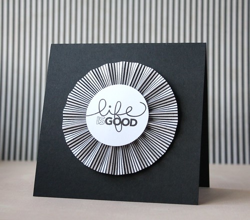
I created the giant demi-medallion with a strip of 5.5 x 24" cardstock. I used foam to ink the exterior edge with white and then used my scoreboard to score every inch on one side and the alternating inches on the other side (if that makes sense).

The stitching around the top exterior of the card is just a fun stitch on my sewing machine. The bottom sentiment is heat-embossed.

I'm submitting this into Papertrey Ink's Make It Monday: A La Carte. The technique I used was selective inking on the "time to relax."

Thanks for stopping by!


{Supplies--all Papertrey Ink unless noted}
  • Cardstock: peach and aqua (Cricut cardstock by Provocraft), Stamper's Select White and Melon Berry
  • Stamps: On My Couch, Tiny Tags, Think Big Favorites 5
  • Ink: Memento Tuxedo Black (Tsukineko), Melon Berry, Aqua Mist and Fresh Snow
  • Dies: Picot Edge Circles (Spellbinders), Tiny Tags
  • Other Tools: Turquoise Blue Glimmer Mist (Tattered Angels), lace (dollar store), sewing machine/thread, white embroidery floss, Big Bite/eyelet (We R Memory Keepers)

Congratulations on Your New Home

A card I made for an acquaintance that I'd like to become better acquainted with! ;)


Some cards are quickies, and some take dedication. This is one of the latter. I'm not particularly fond of working with glitter, but how can papercrafters avoid it?!

I masked the house and airbrushed the blue background, keeping the Eyelet Square die (Spellbinders) in place. I'm still a newbie with the airbrushing... After Copic-ing the house (Boards & Beams stamp set), I pulled out, for the first time ever, my glue stamp pad and used it to add the icicle eaves and snow drifts (Home for the Holidays stamp set). I used a glue pen for additional roof and drifted snow.

The sentiment was stamped and embossed and then the strip inked (Vintage Photo) around the edges. I inked around the eyelet square with Antique Linen. The front panel icicles were punched (Martha Stewart) and the panel/sentiment sewn.

I adhered the whole card together before deciding to ink the card base as well... Turned out alright!

An unusual color combination for me but I like it!


{Supplies--all Papertrey Ink unless noted}
  • Cardstock: Spring Rain, Dark Chocolate, Golden Harvest
  • Stamps: Boards & Beams, Home for the Holidays
  • Ink: Tuxedo Black (Memento), Antique Linen/Vintage Photo (Tim Holtz Distress Ink)
  • Die: Eyelet Square (Spellbinders)
  • Punch: Icicles (Martha Stewart)
  • Copics: Golden Harvest trio, Dark Chocolate trio, Pure Poppy trio, B00, B000, B0000, 0, W1, W3, T1
  • Other Tools: sewing machine/thread, Corner Chomper (We R Memory Keepers), clear embossing powder, Copic Airbrush System, The Essential Glue Pad (Tsukineko), glitter (Stampendous)

A Little Something For the Men

In preparing stock for the Calgary Market Card Sale we had, I realized that I mustn't forget to make a few cards that could easily be given to men. So this posting will feature the designs for masculine cards created.

This first set of four cards are based on the same paper and 6" square sized card with variations. I made a total of eight of these.


The cut out and popped up flourish you see in the next four cards is from  s.e.i's Bridgeport clear stamps. The first two I prefer over the last two you see here. After making a couple cards by popping the flourish up, I just felt that the flourish wasn't quite right. I then took my favorite VersaFine Vintage Sepia ink and ink distressed it. I'm much happier with the look of the flourish now, and you see it here on the first two cards. It reminds me of some of the hand carved flourishes found on antique handcrafted furniture, and very befitting a man - don't you think?


I hand cut 10 of these flourishes. It took a little time, but to me it was worth it; especially once I ink distressed them.


This next set of masculine cards is also all the same sized card, A2s, and using the same paper on each, all with variations in layout and two sentiments.


This next A7 card is made with scraps, and purchased embellishments that have been sitting in my bins for quite a while.You will note there is also a handcrafted envelope (Which I have done for most of the cards made for the Craft Fair Sale). It is a good way to use up all the paper from non-cardstock paper from the large pads of paper one buys.


This next card I thought could be either a masculine or feminine card, but opted to go with masculine. I created it using scraps left over from a class I taught at Scrapbookers Paradise. I used a gold gel pen to create a sophisticated look with a border around the edge of the card. With gold Liquid Pearls I embellished the corners on the green cardstock.


These next two cards are again made using scraps leftover from a class I taught. And, since the flourish stamp is new, and I like it, I used it again. I may have gone a little overboard with the brads, but I wanted to create a masculine feel to the cards.


So these are some of the masculine cards I made for the Calgary Market Fair.