Frame Flip Album

-Another Stay-At-Home Retreat class for April

It's time for another mini-album. Well, not too mini as it measures 10"w x 7 1/2"H, but it's a fun and easy one to make. What I love about this one is that it stands on its own and with a flip of a tab stand you can display it closed or open ready to flip through. Plus, at any time you can add additional pages!


So above is what the end result is, and this is what we start with.


This was part of Kaisercraft's Beyond the Page collection, but is no longer available. I turned it horizontally to prop it up, took out the large panel in the center of the cover, and covered most of the slit in the back cover leaving about 1 1/8" in the center.

 Lets have a look at a couple more photos.

In this next view, if you look closely you can see that there are some pages between the MDF front and back covers.

Maybe in this section of the photo you can see it better.

The flowers are punched from the small and medium Retro Flower punch from EK Success with the tiny butterflies punched from a tiny punch from the same company, and the larger ones with Martha Stewart's Butterfly punch. The leafy branches are punched using Martha Stewart's Branch 2 punch. And Avocado Liquid Pearls used in the flower centers.

I have made a very quick video for you see the details of the framed flip album. You'll have to excuse a few verbal mistakes. There was no time to remake the video so I had to leave it as it is.


This is going to be a fun class, and I look forward to it. Thank you for checking in today, and please feel free to ask any questions in your comment.

Happy crafting everyone!


April Monochromatic Card Class

-Monthly class in creating 4 A7 cards, each a different monochromatic colour scheme

For April's class I chose the colours of orange, green, gray, and blue. I love working in monochromatic colour schemes. And this month we will create cards from the elaborate multi-layered card to the clean and simple (CAS) card. These are they.


I think I need to recheck my camera. I think the settings must have inadvertently changed, because they seem to be a little on the fuzzy side lately.

Any way, let's take a closer look at the orange "Congrats!!" card.


This one is bright, warm and cheerful as it congratulates the receiver. It could even be a graduation card. I used three different oranges in cardstock going toward the orange browns in the choice of ribbon and leaves. You'll note that I covered the white sentiment circle entirely with Stardust Stickles. I had thought originally to cover just the letters, but thought that I should break out of that mold and maybe try filling the entire circle with stickles.

A sightly more side view.


There are an awful lot of Cantaloupe Liquid Pearls on this card, and I was happy that they seem relatively the same size and are well spaced. I hope you can see the layers from this view. If not, here is another view that may better help.


I think this next card is my favorite of the four.


I should make square cards more often. I always seem to like them. This simple gingham is very appealing, homey and comfy. The simple Spellbinder's frames in white work well with the diagonal gingham. The foliage and butterfly are the perfect accent in the upper left corner of the card.

I added Glossy Accents on the leaves to look like dew drops, and put a light layer of Stardust Stickles on the butterfly using Platinum Liquid Pearls for the head and body of the butterfly.


You can see that the frames are popped up on the card, but the next photo shows it even better.


With the gray card, I took four 4 1/2" doilies, cut them in half, and cone rolled them.


The dies for this card are from MFT Die-Namics Well Worn Greeting. By cone rolling the doilies it make them appear much more lacy and ruffly.


Sorry about the blur, but at least you can see how full the doilies look this way. I just realized I forgot to put o the Stardust Stickles on the edges of the diolies! I wanted to add a little sparkle on them. I'll add it on before class.


The last card, the blue one, is I think my second favorite. I used the ink resist technique on the card. I also decided that instead of popping up the sentiment, I would do the reverse.


In heat embossing in white I used the MFT Inspired By Flowers set 3, and used Time Holtz Distress inks, Tumbled Glass, Stormy Sky, & Chipped Sapphire in inking the paper.

Let's check out this CAS card from another angle as well.


Well that's it for this set of monochromatic cards. I look forward to May's class. Well my blog friends, I hope you found some inspiration here, and I thank you for stopping by today. Happy crafting!


Paper Piecing With Julie Dinn!
-Taking more classes with Julie so I can get some cards made for my Grand-daughters...oh, and learn something too!

I've done some paper piecing in the past, but wow!, I learned a few new things from Julie. Wish you were all here and able to take these classes at Scrapbook Parade, too. I don't have photos of the pieces we cut out before putting it all together because I was in a class, but I hope to do that in the future for some of my own paper piecing projects.

These are the cute cards we made in class, but please don't laugh at my colouring. I haven't had the skin and hair colouring classes yet. But my grand-daughters won't know the difference.


We even cut out the little hair elastics and the little flower on her shirt! It was worth it. You can't tell in the photo to well that her shirt is hanging over her pants and is not glued down but loose. I love the Die-Namics daisy!

Julie likes to beautify the insides of her cards, so we did that as well.


The paper piecing of this little girl has 4 layers! And it looks so good in real life.


Love the colours on this card. The challenge with this paper piecing project was the arms and hands. We coloured and cut out an extra set of arms with hands that went under the dress at the top, but in front of the dress at the hands. What a big difference that tip makes in the appearance! Thanks Julie.


I hope we'll have more paper piecing classes with Julie. There is always something to learn out there, isn't there?


Card Keeper - Graphic 45's Place in Time

-something a little different for this collection from Graphic45

We can never have enough things to help us organize our card giving. The Graphic 45 "Place In Time" (12 x 12) is perfect for just this kind of a project. So using 2 BoBunny 9" x 9" canvas bound binder albums along with these beautiful papers, I came up with this. Just FYI, I only had one binder to work with until the order for everything comes in, so I had to hold up the cover for Volume Two - July through December.

On the outside of Volume One - January through June.


I needed to darken the light canvas binding a bit so I inked it with Tim Holtz Antique Linen and my ink blending tool. 

 After cutting out the 9 x 9 pages from the 12 x 12 sheets, I used what was left from them to piece together the background piece for the two front covers. You may be able to see a seem here and there.


I did the same for the little frame on the front of the sunflower paper.
 
Volume Two - July through December


Before I show you the pages inside, I just want to let you know that because this is something that will be frequently used and handled, I opted to keep embellishments minimal. This also would save time in class, as it will be a two day class as is. The participants will have the option to embellish as much as their hearts desire. I may add a few things myself, once the class has been completed.

I also kept the layouts basically the same with just minor changes here and there. This will keep our cutting measurements less varied and more easily put together.

So here are the pages in monthly order.


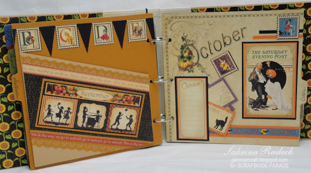
Here you will see a little pocket that has the month as a header followed by lines. This would be where you would record the birthdays for that month. then there are tags tucked in behind. These could be for additional birthdays, anniversaries, or for non-family birthdays keeping just the family birthdays on the front...something like that.


On the left, is the other side of January. This, again, is basically the same for each month page, and holds two pockets. The larger pocket holds the cards and envelopes, while the smaller pocket, behind the images and month label, is  for photos you may want to include in the cards for that month, or for gift cards to include in your cards, or just for your stamps.

So now you cans just scroll down and see all the other pages.


End of Volume One, on to Volume Two.


So that's it for all the pages. 

If you'd like to see the video about this project...


Thank you for stopping by to have a look at all the photos on this post. Hope I didn't bore you with them all.

Hugs & Happy crafting everyone!


I'm Taking Classes With Julie Dinn!

-I'm having so much fun taking classes instead of teaching them, and learning some great new things!

I've always wanted Copics since my daughter Dana has them. While still in Calgary, I was able to use hers on occasion. But upon moving to Victoria a couple of years ago, I made due with water colour pencils, colour pencils, and even my ink pads to colour images with. Needless to say, I didn't do it often.

The opportunity came to Scrapbook Parade, where I currently teach classes, to have the new Spectrum Noir markers. Boy, was I ever excited over that! Then to top it off, Scrapbook Parade was able to have Julie Dinn, a designer from My Favorite Things, who recently moved to Victoria, teach some classes. And guess what class she is teaching? Right! Spectrum Noir!

I just had to take these classes. So Julie designed some really great cards for those of us taking the class. I can hardly wait for the next one and complete the whole series of classes, because then I can use and colour with them in my classes too!

So, bear with me as I share with you my first colouring samples. We had a practice sheet with the three stamps we'd be using in the class. I coloured all three practice ones before proceeding with my actual card ones. These are they.


Here are the actual cards I completed.


This Water Lily stamp is from MFT Inspired By Flowers 3. With each class we purchase two sets with six marker in each. So, for this first class we had the pinks set and the greens. So those were the only markers we had to colour our images with.

Julie loves to beautify the inside of her cards too, so we did in class as well. I rarely do that, because of time. But it is really nice to open the card and see it all pretty inside.


The next card is using the MFT Inspired By Flower set 4. A daisy. I decided to experiment more with the colours and made mine brighter and darker like a Gerber daisy.


I think I have to check to see if I accidentally turned off my "shaky hand" button on my camera.

And the inside to this card...


And the last card is using the Poppy from the MFT Inspire By Flower set 3 stamps. That's the same poppy for the card I posted yesterday for the Colour Series - Bold Red card class.


you'll note that it is lighter than the practice one I coloured. In class everyone coloured theirs more like this light pink. I didn't stop to think at the time that the reason it was a lighter pink was that it went well with the cardstock accent colour on the card mats. I wanted to see if I could get mine closer to red using the pinks when I made my practice one. It wasn't till then that I realized it would look as good. So when I made the one for the card I lightened it to match better with the paper.

Well thank you for sharing with me my first Spectrum Noir colouring class. I'll post the others as I take the classes.

Happy Crafting!