Bullet Journal - First 10 Days of July - Family Reunion Time


Hello everyone!

By the time you are seeing this post, I will have headed off to the family reunion. You have seen my July bullet journal set up, and today I am showing what I have set up for the first ten days of July. Normally I would have a week at a time set up, but as I will be away for 10 days, I thought I would lump those ten together for this set up.

You will be familiar with this set up because I used it before when I went to Alberta and Phoenix to visit family. I like to set up a daily layout when I go away. The top left box is for my photo of the day, the little box just right of it is for recording the weather. The wider column under the photo space is for my daily journaling or highlights of the day. The boxes in the narrower column on the right are for scheduling and 'to do' lists with a section for 'gratitude' and 'expenses'. at the bottom is my food & water tracker.


Even though each day is set up the same. I wanted to show you how I made each day just a little different by using a different washi tape for each day.


More different washi tape...


At the end of the ten days I made a spread to add additional highlights of the family reunion and a place to evaluate the best and worst parts so that I can work them out better for the next one. I also have a section to record suggested ideas for the next reunion.


Well, that is it for this post. I will have four days after these ten days to create a weekly set up and will show that to you some time in the next 10 to 12 days.

Thank you for stopping by to have a look, and I hope that you are inspired to start your own bullet journal or create a different set up in your own bujo.

Happy creating!


Family Birthday Cards I - G45 Fairy Dust


Hello Everyone!

At our Family Reunion, one of the things we will be doing is celebrating all the Summer Birthdays, and as I have few cards at the moment to give away, I had to make some of them. The three that I made were all for girls between the ages of 11 and 14. So, I decided to use the Graphic 45 Fairy Dust collection to make the cards with.

This first Card I am showing you is a A7 (5 x 7) card that opens up a bit like a trip-tic.

For the front of this card I created a frame, something I seem to be doing a lot of late, by cutting strips, backing with foam tape, cutting the angles and attaching. Then I popped up the centre piece that I cut out of one of the cut-a-parts in the collection. You can't see in the photos, but I did put some sparkle onto the fairy wings.


From this side view you can see the layering.


When you open the card you are greeted with some fussy cut images and a sticker from the collection.


When you open the last section you are greeted with the paper that has flowers and fairies all over. The centre section I painted out when I edited, because I forgot to take the photos before writing in the card. I do know that this 11 year old girl is going to love displaying this card on her desk or dresser. I sparkled up all of the fairy wings on the paper here too.


I hope that you enjoyed this fun card. When was the last time you made a card like this? Do you want to try making one again? Have fun!

Happy creating!


July Bullet Journal Set Up


Hello everyone!

I will be at a family reunion in a week from now, when I would normally post the next month's set up in my bullet journal. For that reason I had to set up the month of July earlier so that I would have a bullet journal to use during those first 10 days of July. I did some different things in setting up the month of July, not so much the layouts, but what I used to create the July theme.

July 1st is Canada Day, and I chose that as my July theme. I used a stamp set I have had for a few years and finally used for the first time, and for those of you that are scrapbookers and card makers will see that I also used a couple of Spellbinders dies to create paper die cut stickers. I used a 5" x7" card envelope in a beautiful red to cut into 3/16" strips to use for some of my red lines and borders. I did not want red marker to be seen through the paper and wanted them to look straight, and for that reason chose to do this. It worked pretty well. I must, however, apologize for the slight blurriness of the photos in today's post. I am not sure what transpired to make them so. I believe it happened in the editing of the photos. But, I believe you can still see everything well enough.

So as you can see in the photo below, the left page is all stamped onto a piece of paper. I did this so that the stamping would not show through the paper to the other side. It works well. I even found an older silver metallic ink ad to use for the fireworks. I was actually surprised that the ink still worked well and had not dried out. I then took my metallic silver gel pen and traced around the edge of the paper I stamped on to create a silver border.


On the right page, above, I stamped the Mounted Police and coloured it with markers, cut it out and attached. The banner/sign is a layered die cut, and the maple leaf as well. I used the silver pen to draw in the veins of the leaves. I love the extra wide washi tape with the watercolour scenes that go so well with the theme. In the western part of Canada, this could so easily be what you would see.

I decided to see if I could give a better look of the silver inked fireworks in this next close up.


And next, a closer look at the right page showing you the glitter washi tape, the red paper strip, the narrow lines and dot washi, and the wide scenery washi.


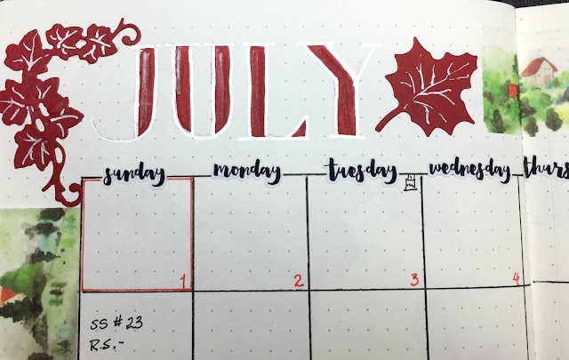
Next in my bullet journal comes the 'month at a glance' or monthly calendar set up.


Here is a closer look at the July lettering. Hopefully you can see the silver metallic outline of the letters.


The next spread is my monthly 'brain dump'. For the month of June, I did not fill my brain dump pages as much as I normally do, but it is still nice to have that space.

Here, I have made a silver line border with maple leaf corners, and used that wide scenery washi tape framed in with faux stitching and silver lined border.


Wanting to keep track of cards created for classes and card making kits, I like to include a space to put in a photo, name and date of the project or class, and list of things I need to for the launch of the kit or class to mark completed when done.


Next comes my monthly finance tracker. As you can see, I added a family reunion spending section for this month.


The next photo is my monthly habit tracker. However, as you can see it is incomplete. I still need to complete numbering the days in the boxes and add the list of things I will be tracking. But, I needed to get this posted as I am getting busy preparing and packing things for the reunion over the next few days. Who would have thought there was so much to prepare to take with you when you are in charge of organizing the reunion! You do get the idea of the layout despite the lack of it's incompleteness, however. You can also see that it is a little different from June's habit tracker seen in this post.


Well, that is it for the July monthly set up. The next post will be for the first week set up. It will be different, however, in the fact that I will be setting up for the 10 days of the reunion, rather than the usual weekly spread.

I would love to hear what you have to say about my July set up, or any questions you may have that you would like me to answer for you. If you have a bullet journal, I would love to hear if you have chosen a theme for July.

Happy creating everyone!


Bullet Journal - Week 26 - June 24th to 30th


OK. This is definitely the half way point of the year. Week 26. Everything is basically the same with the exception of switching the colour to a light pink. For this week, I do not have any classes and decided that I will be very busy with the last minute details of the run-on, so I did not divide my days into the three usual categories and using the space to help prepare to leave on the 29th. Those are the only 2 differences from the previous weeks.


This spread remains the same...just switched to light pink.


I only kept the reunion note pages to two this time, but added a packing page. When I had taken the photos, I had not yet decided how to break it down, so it is just two silver metallic columns here.


I do have a blank page that I left, just incase I needed it. And, the weekly journaling section is still the same.


Hope you have enjoyed my June Bullet Journal layouts. For July, I have a Canada Day Theme going, so be sure to check that out when it get's posted next week. I will be away, but will have it scheduled for you.

Happy creating! And happy journaling!


Photos From The Start of More Shabby Chic Classes


Welcome back! Not just to you, my blog friends, but to starting up shabby chic card classes again. Remember this class post? Well yesterday we had that class, and I would like to share with you the photos I took of the ladies creating their cards.

I only tooks photos when they were nearly done with each card.


And then the last card...


They did such a lovely job on their cards, didn't they? At the end of class I took a photo of all of their cards together.


The 49th & Market Tattered Garden collection was such a gorgeous paper to work with.

Hope that you are inspired to try some shabby chic cards...

Happy creating!


Bullet Journal - Week 25 - June 17th to 23rd


Wow! Just about 1/2 way through the year! Where did all the time go?

The first week of June I used a light gray marker, a silver metallic gel pen, and circle punched pink images of flowers & birds. Last week I used a light blue marker with silver metallic gel pen and the same circle punched images. This week I am switching to a light green marker, with the same silver pen and circle punched images.


Still trying to figure out if I like this new set up or not. Especially the one line for my Gratitude section. For July I may consider another way to do this, or just make it 2 lines for each day.

I am still including pages to write notes for the up coming reunion. Do you like the silver metalling pen outline around the green lettering? I do.


With the reunion getting closer I decided to make three pages for notes this time.


I still have my weekly journaling section, but since the layout for that has not changed and is very simple, I did not include it in my photos for you this week.

Happy creating! And, happy journaling!


New Birthday Card With Altenew Majestic Bloom - not for a class


I know so many people, many are family, that have their birthdays during the Summer months. So I sometimes need to make new cards if I am running out. I have dozens of cards on display at the studio but I can not use them. I thought it would be good to play with my Altenew Majestic Bloom stamp set, since I love the look of it, and I need practise using the stamps.


This card is for my Mom's best friend. Mom is no longer here, so I try to remember her friend's birthday and give her a card.

I was originally thinking of using silver embossing powder for this card, but could not find it. So, I went with Altenew's Platinum embossing powder and I loved it! Must remember to use that colour more often.


This next photo close up is to show you the stencilling I did in the background using NUVO Mousse in Gunmetal Gray. I wanted to use the Platinum, but found that was one colour I did not have.


The next two photos show a side view so that you can see the layering of the card better.


You can see under the pink blossom, that I used two layers of pop up tape at the bottom of the flower. The top part that is overlapping the blue blossom, has a single layer. And the banner is popped up as well.


I think I am getting better at using this stamp set. I am thinking of try a couple of watercolour versions with this set as well.

Hope you enjoyed seeing the card, and are inspired to create something.

Happy stamping!


Something Special For My Dad's Birthday


Hello Everyone!

Do you hang on to your favourite cards? I have done that from time to time. The one I am sharing with you today is one such card. As today is my Dad's 85th birthday, I was going through the cards I have. Most of them are newer cards, but I did not find something that spoke to me of my Dad. So, I started to look at the cards that are my favourites and that I have hung on to, when I came across this card made about 6 years ago. I knew it was time to give it away. It spoke to me of my Dad.

You have seen this card on my blog twice before, but since it was so long ago, I decided to repost the photos. I posted this card as part of a group that I taught for a class (Olde Curiosity Shoppe), and then again when Graphic 45 featured it on their blog along with other creative creations from the same collection.


So here is the card that I decided to give my Dad for his birthday card today.


This card is very thick from all the popping up of layers over each other, so a good one to give in person. Some of you may remember having taken this class from me. I think this was the first class where I had some major fussing cutting involved.

Here is a side view.


Hope you enjoyed going down memory lane with me on this card. Who knows, if you have some of this paper, it may give you inspiration to create something like this one.

If you click on the links at the start of this post, there are three different posts to look at related to this card.

Have a great day everyone, and happy creating!